Reproducing Visualization in Publications
Quick recap/practice
To warm up, we’re going to use one of Cassandra’s data sets, which has chromosome positions and z-scores. We’ll do each of these exercises together.
# Load in the data
BSAResults = read.csv("data/BSAResults.csv")

# Find the unique values of the chromosomes. How do we find the column name?
str(BSAResults)
## 'data.frame': 49432 obs. of 6 variables:
## $ X : chr "result.1" "result.2" "result.3" "result.4" ...
## $ CHROM : chr "I" "I" "I" "I" ...
## $ POS : num 100007 1035 1074 1101 1173 ...
## $ Bulk : num -0.08758 0.1827 -0.00987 0.01895 0.87397 ...
## $ Parent : num 3.554 0.537 -0.345 -0.12 -0.393 ...
## $ Interaction: num -0.01715 0.13848 0.31904 -0.00762 -0.18258 ...unique(BSAResults$CHROM)## [1] "I" "II" "III" "IV" "V" "VI" "VII" "VIII" "IX" "X"
## [11] "XI" "XII" "XIII" "XIV" "XV" "XVI"# Filter for Chromosome II using dplyr's filter() function, and pipe through head() to output only the first 10 lines
BSAResults %>%
filter(CHROM == "II") %>%
head(., n = 10)## X CHROM POS Bulk Parent Interaction
## 1 result.11000 II 100153 -0.18330726 -0.0646732103 0.19943965
## 2 result.21000 II 100367 -0.18800155 -0.2912844665 0.28590390
## 3 result.31000 II 100413 -0.32764216 -0.3031255854 0.52362311
## 4 result.41000 II 100878 0.02040887 0.1185267276 -0.16398910
## 5 result.51000 II 101103 -0.13385976 -0.0100344121 -0.01602947
## 6 result.6432 II 101289 -0.25282081 0.0817157785 0.21342401
## 7 result.7100 II 101340 -0.19522650 0.1584760726 -0.15293462
## 8 result.8100 II 10136 -0.30926532 -0.0078019497 -0.02303257
## 9 result.9100 II 101507 -0.19850031 -0.0007044734 0.08039453
## 10 result.10100 II 101581 0.07333291 0.0641751118 -0.28421660# Plot a scatter plot of the Bulk with x-axis being POS and y-axis being Bulk values
BSAResults %>%
filter(CHROM == "II") %>%
ggplot(., aes(x = POS, y = Bulk)) +
geom_point()
# If we want plot Bulk, Interaction, and Parent for Chr II at once, we need to pivot the data to long format. How do we do so?
BSAResults %>%
  pivot_longer(., cols = c(Bulk, Interaction, Parent)) %>%
  head()
## # A tibble: 6 × 5
## X CHROM POS name value
## <chr> <chr> <dbl> <chr> <dbl>
## 1 result.1 I 100007 Bulk -0.0876
## 2 result.1 I 100007 Interaction -0.0171
## 3 result.1 I 100007 Parent 3.55
## 4 result.2 I 1035 Bulk 0.183
## 5 result.2 I 1035 Interaction 0.138
## 6 result.2 I 1035 Parent 0.537# Then to plot, we can separate our data by "name" - rename this column "Z_score" using pivot_longer()
BSAResults %>%
pivot_longer(., cols = c(Bulk, Interaction, Parent), names_to = "Z_score") %>%
# There's a more interesting thing happening on Chr VIII. Filter for this instead.
filter(CHROM == "VIII") %>%
# Plot the pivoted points with them colored by Z_score.
ggplot(., aes(x = POS, y = value, color = Z_score)) +
geom_point()
# There are a lot of points. Change the opacity of these points.
BSAResults %>%
  pivot_longer(., cols = c(Bulk, Interaction, Parent), names_to = "Z_score") %>%
  filter(CHROM == "VIII") %>%
  ggplot(., aes(x = POS, y = value, color = Z_score)) +
  geom_point(alpha = 0.3)
# We now want to change the names to reflect what the value actually is. Add labels to the plot.
BSAResults %>%
  pivot_longer(., cols = c(Bulk, Interaction, Parent), names_to = "Z_score") %>%
  filter(CHROM == "VIII") %>%
  ggplot(., aes(x = POS, y = value, color = Z_score)) +
  geom_point(alpha = 0.3) +
  xlab("Coordinate on Chromsome (nt)") +
  ylab("Z-Score") +
  ggtitle("The Light from the Other End of the Tunnel") +
# A different theme might be better. Let's use theme_classic()
  theme_classic()
# BONUS: it would be great to plot all chromosomes on the plot at once. Add facet_grid(~CHROM) to do this, and once it works, remove the filtering of your CHROM column.
BSAResults %>%
  pivot_longer(., cols = c(Bulk, Interaction, Parent), names_to = "Z_score") %>%
  # filter(CHROM == "VIII") %>%
  ggplot(., aes(x = POS, y = value, color = Z_score)) +
  geom_point(alpha = 0.3, size = 0.1) +
  xlab("Coordinate on Chromsome (nt)") +
  ylab("Z-Score") +
  ggtitle("The One where Everything is Plotted Together") +
  theme_classic() +
  facet_grid(~CHROM, space = "free_x") +
  # NEW: Another way to limit the y
  coord_cartesian(ylim = c(-1.5, 1.5)) +
  guides(color = "none")
Today, we will be looking into the first figure from Massively parallel Cas13 screens reveal principles for guide RNA design from the Sanjana Lab.
The main reason we selected this paper is because: First, the visualization they used are fairly popular and meets what we covered in previous sessions; second, they did an excellent job in sharing their data and code, so you will have this unique chance to work with real data and know exactly how the authors performed their analyses and visualization if you take the time to read their code.
Figure 1b: BoxPlot
Figure 1b is a panel of boxplots showing log-transformed enrichment scores of different types of crRNAs (the equivalent to sgRNAs for Cas13a).
The processed (normalized and batch-corrected) data for crRNAs in this tiling
screen is provided in data/GFP_screen_crRNA_enrichments.csv. Specifically:
- crRNAs are categorized in to several categories based on their targets in
type - Log-transformed enrichment scores are stored in
meanCS.BIN1
First, let’s load in the data and see what it looks like
#Load in our data
GFP_Results = read.csv("data/GFP_screen_crRNA_enrichments.csv")

#See what the data looks like
str(GFP_Results)
## 'data.frame': 7500 obs. of 17 variables:
## $ p.BIN1 : num 0.03714 0.00531 0.05278 0.00993 0.81008 ...
## $ p.BIN2 : num 0.00441 0.06989 1 0.31136 1 ...
## $ p.BIN3 : num 0.0164 0.038 0.3089 0.2385 0.6272 ...
## $ p.BIN4 : num 0.1162 0.0542 0.2063 0.012 0.8689 ...
## $ logBIN1 : num 1.4302 2.2752 1.2776 2.0029 0.0915 ...
## $ logBIN2 : num 2.355 1.156 0 0.507 0 ...
## $ logBIN3 : num 1.785 1.42 0.51 0.622 0.203 ...
## $ logBIN4 : num 0.935 1.266 0.686 1.923 0.061 ...
## $ meanCS.BIN1 : num 0.698 0.973 1.167 1.055 0.953 ...
## $ meanCS.BIN2 : num -0.6699 -0.2926 -0.0292 -0.3766 NA ...
## $ meanCS.BIN3 : num -0.923 -0.469 -0.589 -0.499 -0.852 ...
## $ meanCS.BIN4 : num -0.658 -0.408 -0.573 -0.689 -0.67 ...
## $ medianCS.BIN1: num 0.742 0.97 1.167 1.235 0.953 ...
## $ medianCS.BIN2: num -0.6353 -0.2197 -0.0292 -0.0923 NA ...
## $ medianCS.BIN3: num -1.019 -0.446 -0.589 -0.458 -0.852 ...
## $ medianCS.BIN4: num -0.774 -0.398 -0.573 -0.762 -0.67 ...
## $ type : chr "Perfect Match" "Perfect Match" "Perfect Match" "Perfect Match" ...Next we want to change the “type” column into factors. We can do this by using the function factor() which we went over last class, and then add the labels function to change the words into acronyms.
# Note that each type is:
# 1. Represented as acronyms in the figure
# 2. Are NOT arranged in alphabetical order
# We can see the need to transform the type column to a factor

GFP_Results$type = factor(
  x = GFP_Results$type,
  levels = c(
    "Perfect Match",
    "First Order",
    "Random Double",
    "Consecutive Double",
    "Consecutive Triple",
    "Non-Targeting"
  ),
  labels = c(
    "PM",
    "SM",
    "RD",
    "CD",
    "CT",
    "NT"
  )
)
Next we can make a basic boxplot, using ggplot and filtering for non NA values:
GFP_Results %>%
  # This is to remove the rows where meanCS.BIN is NA
  filter(!is.na(meanCS.BIN1)) %>%
  #basic elements of the plot
  ggplot(., aes(x = type, y = meanCS.BIN1)) +
  geom_boxplot() +
  #labels
  ggtitle("All crRNAs") +
  xlab("") +
  ylab("log2(FC)")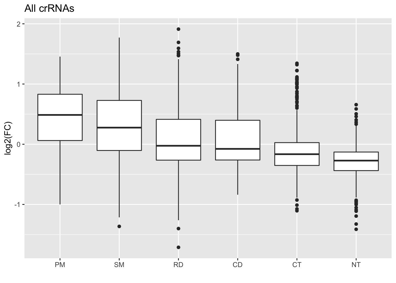
First of all, the colors are different. We can change these by setting the hex codes to match the Sanjana lab’s colors, then inputting this vector of hex codes into the scale_fill_manual() function:
# The color palette used in the paper
#### BONUS: Change the colors and run the chunk to see what happens to the
#### plot!!
sanjana_colors = c(
  "#E69F00", "#D55E00", "#009E73", "#0072B2", "#56B4E9", "#999999"
)

GFP_Results %>%
  filter(!is.na(meanCS.BIN1)) %>%
  #basic elements of the plot
  ggplot(aes(fill = type, x = type, y = meanCS.BIN1)) + geom_boxplot() +
  #labels
  xlab("") + ylab("log2(FC)") + ggtitle("All crRNAs") +
  #colors
  scale_fill_manual(values = sanjana_colors)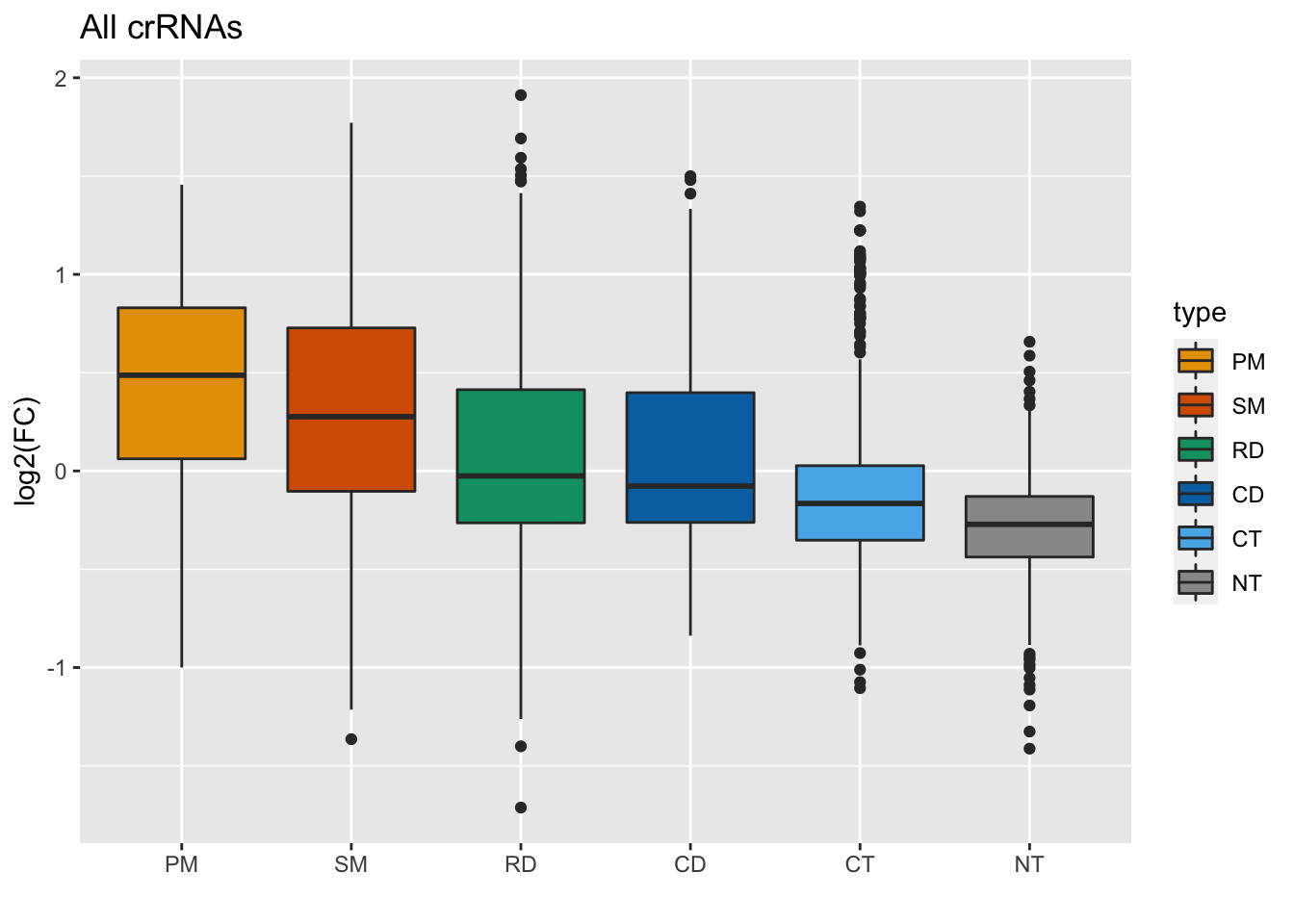
We can also make the outliers smaller, using the outlier.shape and outlier.size functions in geom_boxplot().
GFP_Results %>%
filter(!is.na(meanCS.BIN1)) %>%
#basic elements of the plot
ggplot(aes(fill = type, x = type, y = meanCS.BIN1)) + geom_boxplot(outlier.shape = 20, outlier.size = 0.05) +
#labels
xlab("") + ylab("log2(FC)") + ggtitle("All crRNAs") +
#colors
scale_fill_manual(values = sanjana_colors)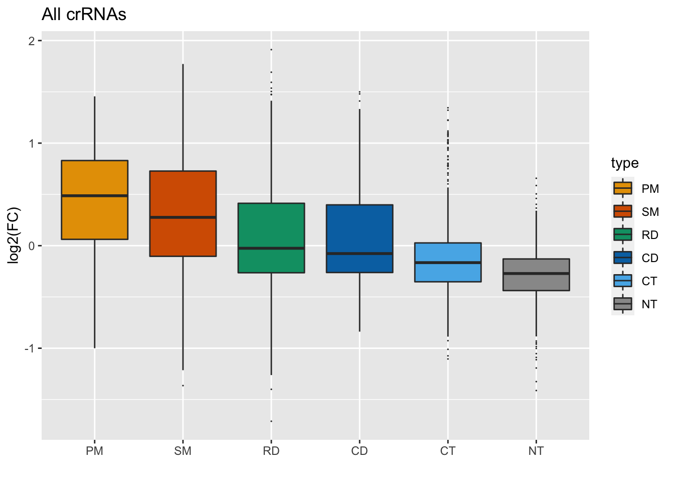 Next, let’s reduce the white space by adding a ylim argument:
GFP_Results %>%
  filter(!is.na(meanCS.BIN1)) %>%
  #basic elements of the plot
  ggplot(aes(fill = type, x = type, y = meanCS.BIN1)) + geom_boxplot(outlier.shape = 20, outlier.size = 0.05) +
  #labels
  xlab("") + ylab("log2(FC)") + ggtitle("All crRNAs") +
  #colors
  scale_fill_manual(values = sanjana_colors) +
  #y axis limits
  ylim(c(-1.5,1.5))
## Warning: Removed 15 rows containing non-finite values (stat_boxplot).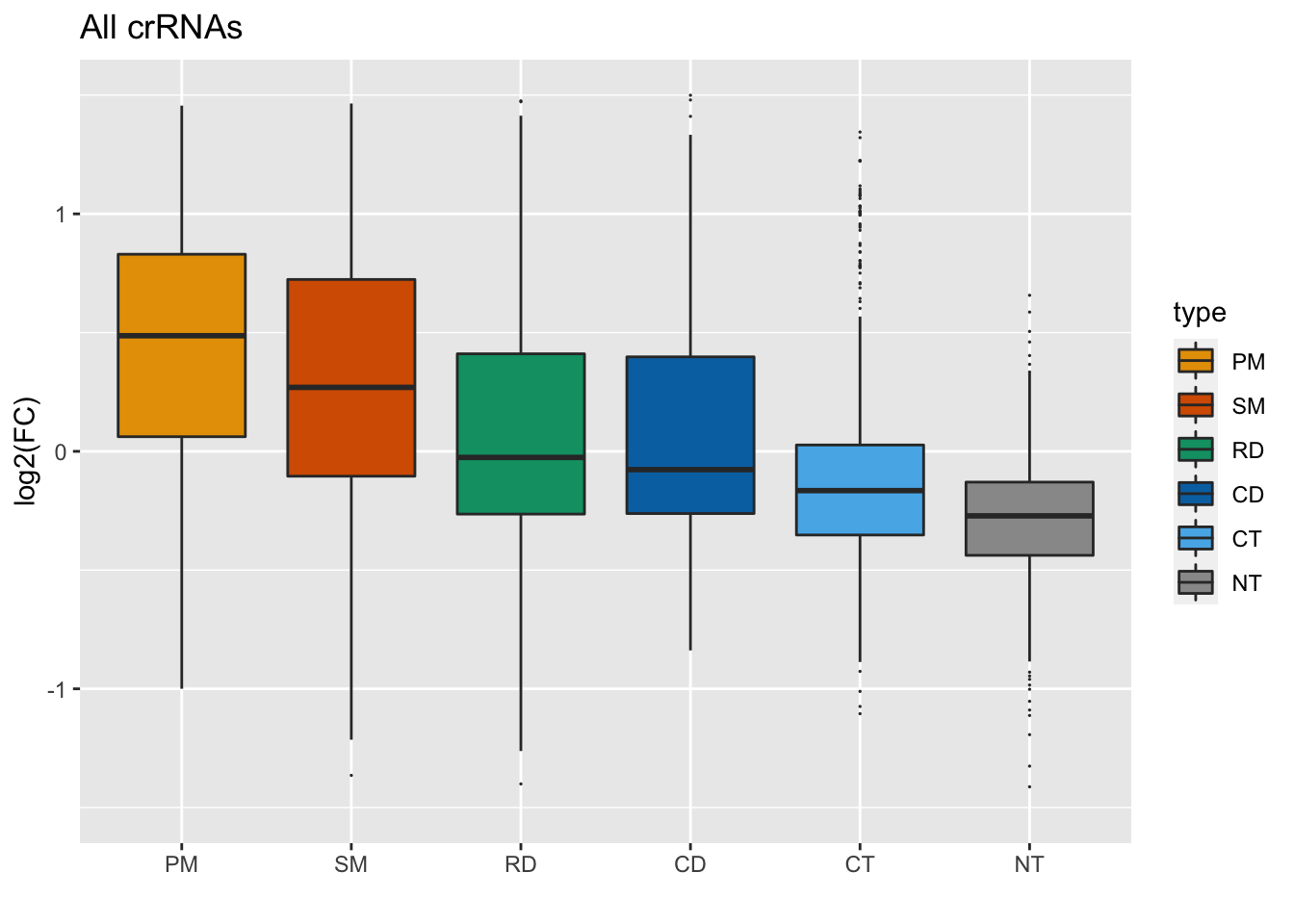
Finally, we’re going to use a new function called coord_fixed() to restrict the aspect ratio of the plot.
GFP_Results %>%
  filter(!is.na(meanCS.BIN1)) %>%
  #basic elements of the plot
  ggplot(aes(fill = type, x = type, y = meanCS.BIN1)) + geom_boxplot(outlier.shape = 20, outlier.size = 0.05) +
  #labels
  xlab("") + ylab("log2(FC)") + ggtitle("All crRNAs") +
  #colors
  scale_fill_manual(values = sanjana_colors) +
  #y-axis limits and ratio
  ylim(c(-1.5,1.5)) + coord_fixed(ratio = 6/3) +
  # Remove legends
    guides(fill = "none") +
    # Remove x-axis line and tick
    theme(
      axis.ticks.x = element_blank(),
      axis.line.x = element_blank()
    )
## Warning: Removed 15 rows containing non-finite values (stat_boxplot).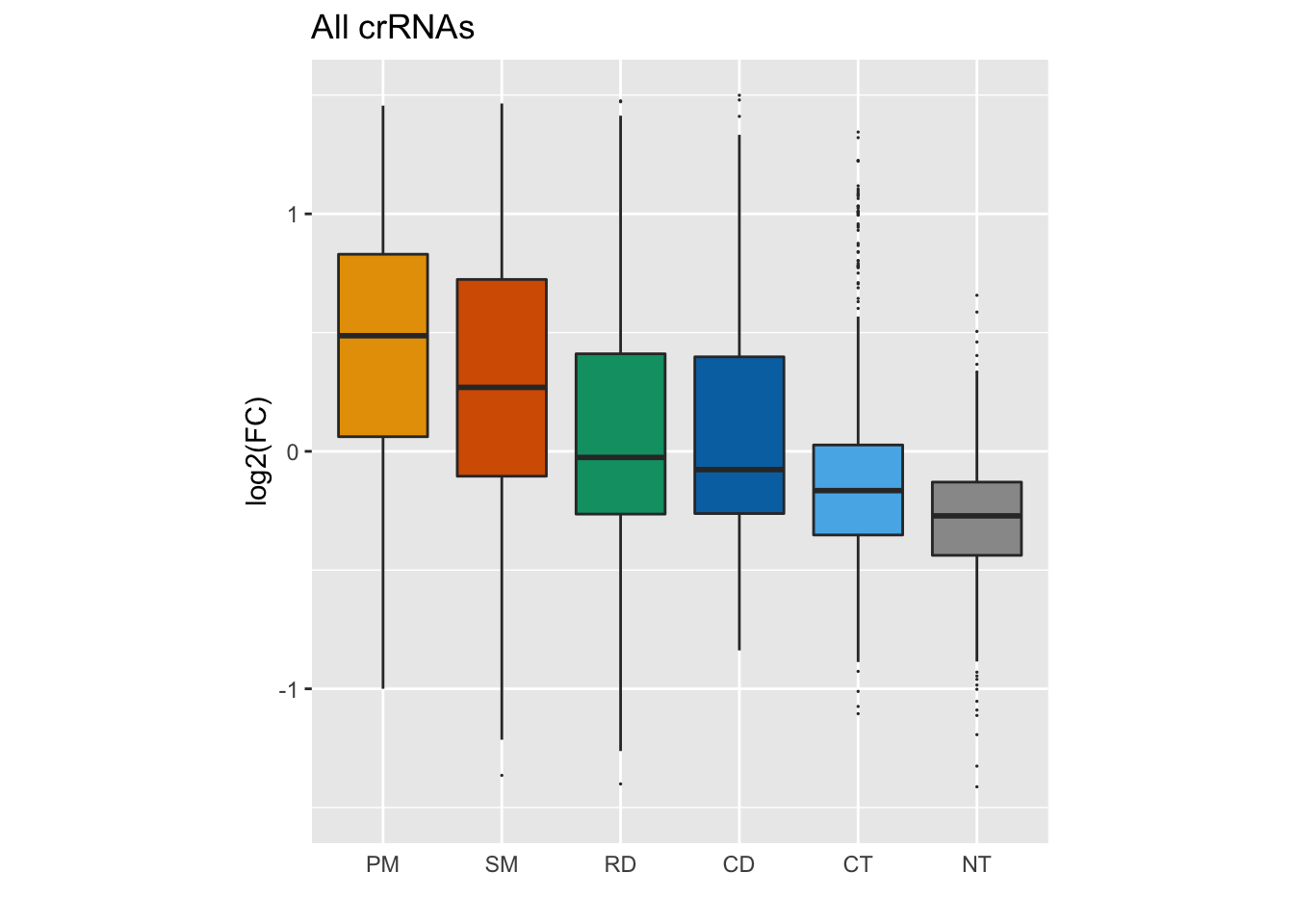
And finally, for a publication-level plot, we’ll remove our legend and x axis ticks using guides() and theme(), and then set our overall theme to theme_classic().
GFP_Results %>%
  filter(!is.na(meanCS.BIN1)) %>%
  #basic elements of the plot
  ggplot(aes(fill = type, x = type, y = meanCS.BIN1)) + geom_boxplot(outlier.shape = 20, outlier.size = 0.05) +
  #labels
  xlab("") + ylab("log2(FC)") + ggtitle("All crRNAs") +
  #colors
  scale_fill_manual(values = sanjana_colors) +
  #y axis limits and ratio
  ylim(c(-1.5,1.5)) + coord_fixed(ratio = 6/3) +
  # Remove legends
  guides(fill = "none") +
  theme_classic() +
  # Remove x-axis line and tick
    theme(
      axis.ticks.x = element_blank(),
      axis.line.x = element_blank()
    )
## Warning: Removed 15 rows containing non-finite values (stat_boxplot).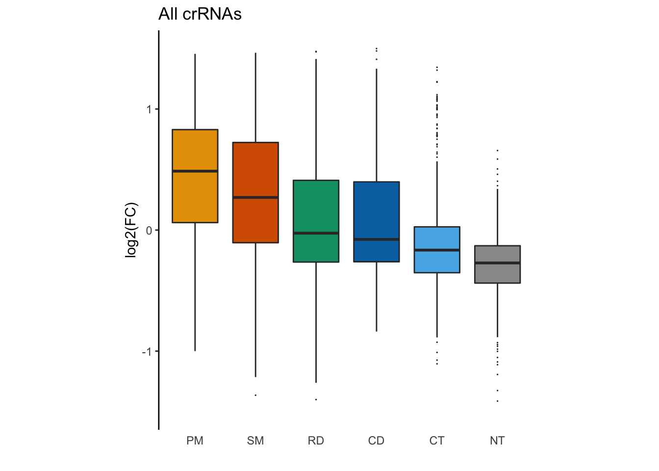
Figure 1c: Scatter plot with jitter
Figure 1c is a panel of scatter plots with jitter showing differences in log-transformed enrichment scores of individual crRNAs of different types.
The processed data for individual crRNAs is provided in
data/GFPTiling_individual.csv. Specifically:
- crRNAs are categorized in to several categories based on their targets in
MatchType - Differences of log-transformed enrichment scores are stored in
DeltaCS
# Load data
tiling_result = read.csv("data/GFPTiling_individual.csv")

# Take a look at your data
str(tiling_result)
## 'data.frame': 179 obs. of 10 variables:
## $ Screen : chr "GFP" "GFP" "GFP" "GFP" ...
## $ GuideName : chr "crRNA004:7-33" "crRNA004:7-33_consecDouble_01" "crRNA004:7-33_consecDouble_02" "crRNA004:7-33_consecDouble_03" ...
## $ Guide : chr "crRNA004" "crRNA004" "crRNA004" "crRNA004" ...
## $ MatchType : chr "Perfect Match" "Consecutive Double" "Consecutive Double" "Consecutive Double" ...
## $ MatchPos : int 33 33 33 33 33 33 33 33 33 33 ...
## $ Annotation: chr "CDS" "CDS" "CDS" "CDS" ...
## $ meanCS : num 1.0546 0.9534 0.839 0.4866 -0.0992 ...
## $ pVal : num 0.00993 0.81008 0.02679 0.07028 0.172 ...
## $ log10pVal : num 2.0029 0.0915 1.572 1.1532 0.7645 ...
## $ DeltaCS : num 0 -0.101 -0.216 -0.568 -1.154 ...#Find the unique values for your MatchType column
unique(tiling_result$MatchType)## [1] "Perfect Match" "Consecutive Double" "Consecutive Triple"
## [4] "First Order" "Random Double"# Make MatchType a factor
tiling_result$MatchType = factor(
x = tiling_result$MatchType,
levels = c(
"Perfect Match",
"First Order",
"Random Double",
"Consecutive Double",
"Consecutive Triple"
),
labels = c(
"PM",
"SM",
"RD",
"CD",
"CT"
)
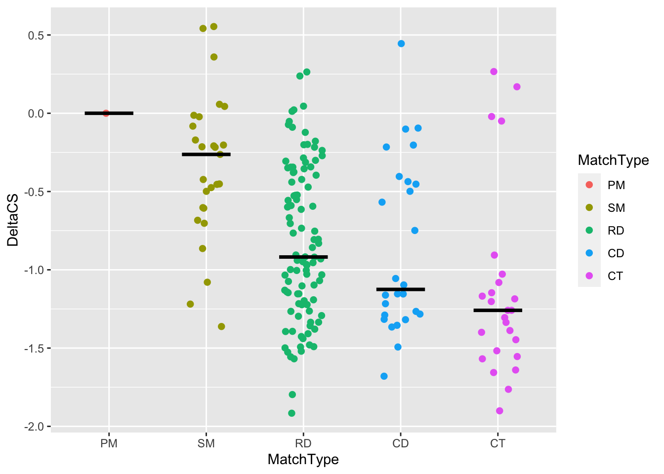
)Next, let’s make the basic ggplot for the tiling result, with MatchType on the x axis, DeltaCS on the y axis, and colored points by MatchType. You’ll want to use geom_jitter() rather than geom_point(), with a width of 0.2, a size of 3, and a shape of 20.
tiling_result %>%
#Filter out the NAs in the DeltaCS column
  filter(!is.na(DeltaCS)) %>%
#Make your ggplot scatter plot here
  ggplot(., aes(x = MatchType, y = DeltaCS, color = MatchType)) +
  geom_jitter()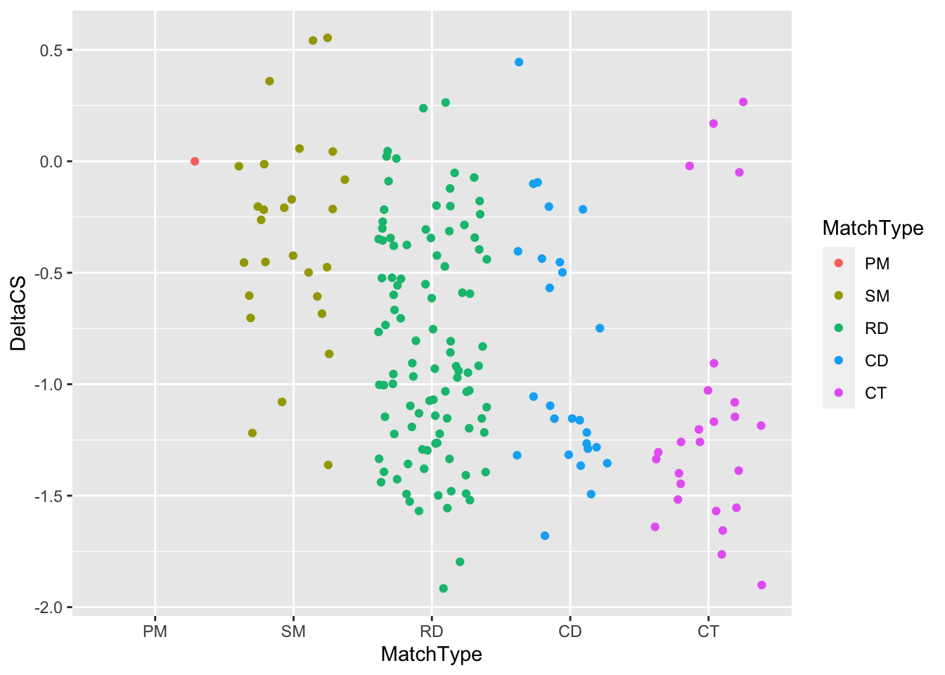
We’ll add horizontal lines using the new function stat_summary(), which provides plotting of simple summary statistics. First, let’s look up the documentation for stat_summary().
#What is the other way to find the help menu?
?stat_summary
Let’s go ahead and use stat_summary, finding the median of each group:
tiling_result %>%
  filter(!is.na(DeltaCS)) %>%
  ggplot(aes(x = MatchType, y = DeltaCS, color = MatchType)) +
    geom_jitter(
      # Do you notice several things are different from your plot above
      # and the real one in the paper?
      # The size of the points and how wide they spread/jitter are the most
      # obvious to me, so we are fixing those here.
      width = 0.2,size = 3,shape = 20
    ) +

    # Add a horizontal bar at the median of each group
    # NEW FUNCTION!! stat_summary() provides plotting of simple summary
    # statistics (defined by fun (function to summarize each group)) with several
    # types of plots (defined by geom)
    stat_summary(
      fun = median,
      geom = "crossbar",
      width = 0.5,
      color = "black"
) 
Next, we can scale our y axis continuously, as follows:
tiling_result %>%
  filter(!is.na(DeltaCS)) %>%
  ggplot(aes(x = MatchType, y = DeltaCS, color = MatchType)) +
    geom_jitter(width = 0.2,size = 3,shape = 20) +
    stat_summary(fun = median,geom = "crossbar",width = 0.5, color = "black") +

  #scaling function
    scale_y_continuous(limits = c(-2, 0.5), breaks = c(seq(-2, 0)))
## Warning: Removed 2 rows containing non-finite values (stat_summary).## Warning: Removed 2 rows containing missing values (geom_point).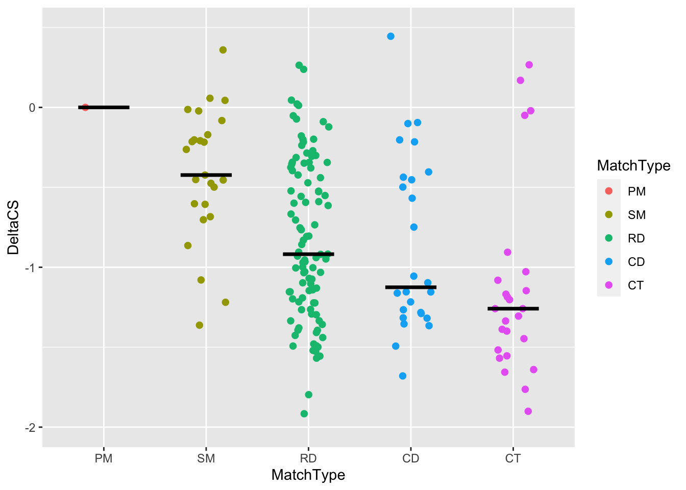
To finish up this plot, we’ll want to set the following arguments. With a partner, add these to your plot:
- title your plot “Individual crRNA”
- remove the x axis label
- set the y axis label to “delta log2(FC)”
- set the coordinate ratio to 7/3.5
- set the colors to sanajana colors as we did before (note that this time the function has to be scale_color_manual rather than scale_fill_manual)
- Remove x-axis line and tick as we did before
# Your publication-ready plot here
tiling_result %>%
  filter(!is.na(DeltaCS)) %>%
  ggplot(aes(x = MatchType, y = DeltaCS, color = MatchType)) +
  geom_jitter(width = 0.2,size = 3,shape = 20) +
  stat_summary(fun = median,geom = "crossbar",width = 0.5, color = "black") +

  #scaling function
  scale_y_continuous(limits = c(-2, 0.5), breaks = c(seq(-2, 0))) +
  scale_color_manual(values = sanjana_colors) +
  coord_fixed(ratio = 7/3.5) +
  # Set axis labels
  xlab("") +
  ylab("Delta log2(FC)") +
  ggtitle("Individual crRNAs") +
  theme_classic() +
  theme(
    axis.line.x = element_blank(),
    axis.ticks.x = element_blank()
  ) +
  guides(color = "none")
## Warning: Removed 2 rows containing non-finite values (stat_summary).## Warning: Removed 2 rows containing missing values (geom_point).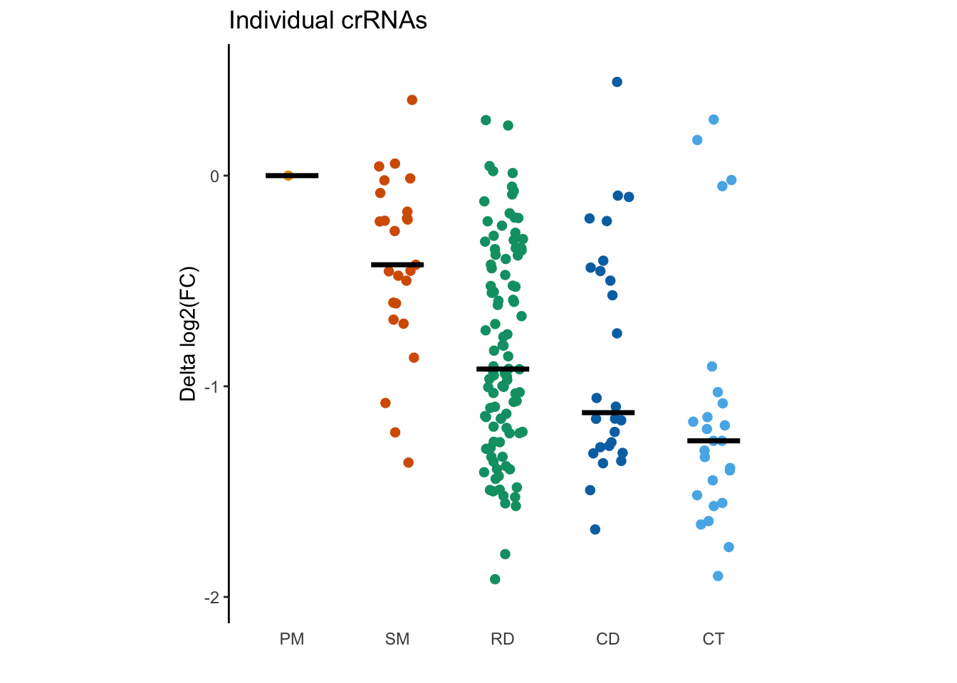
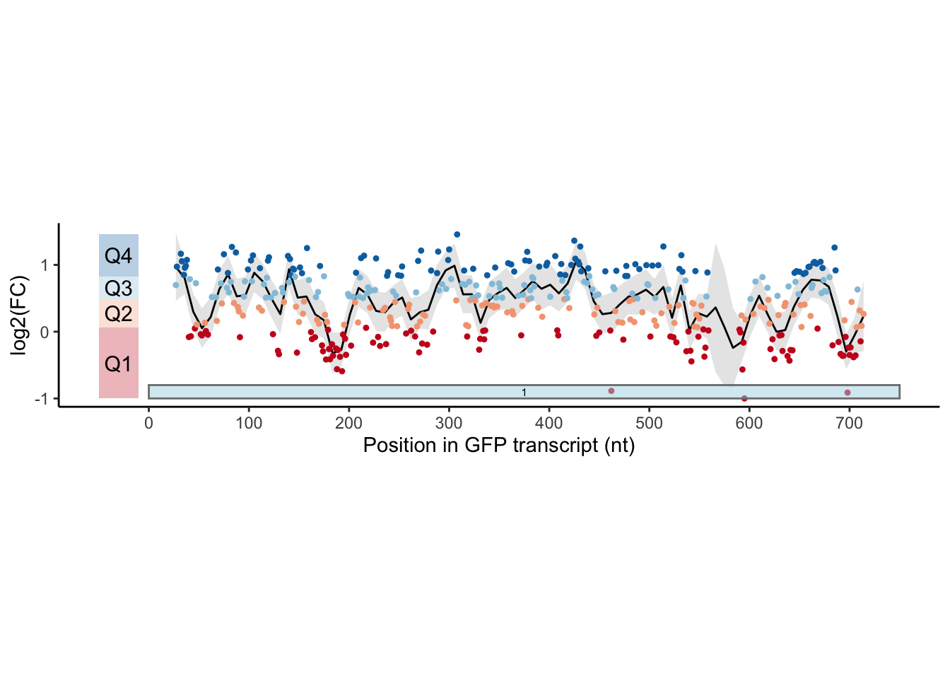
Figure 1d: Scatter plot with a smooth line
Figure 1d is a panel of scatter plots with a smooth line for enrichment scores of individual crRNAs targeting different regions of the GFP transcript.
The processed data for individual crRNAs that target GFP is provided in
data/GFPTiling_individual_full.csv. Specifically:
- Log-transformed enrichment scores are stored in
meanCS - The points are plotted over the GFP transcripts, and the coordinates of
matching site is in
MatchPos - The points were colored by which quantile it falls into.
Quantile is just binning values into four bins, and dplyr has another
function to determine *which quantile a row belongs to by a numeric column
of your choice, and the syntax is ntile(column, number_of_bins).
A minimal example of its usage is:
exdf = data.frame(
  value = 1:10
)


exdf %>% mutate(
  split_at_median = ntile(value, 2),
  quantile = ntile(value, 4)
)
## value split_at_median quantile
## 1 1 1 1
## 2 2 1 1
## 3 3 1 1
## 4 4 1 2
## 5 5 1 2
## 6 6 2 2
## 7 7 2 3
## 8 8 2 3
## 9 9 2 4
## 10 10 2 4Please observe the figure and propose your way of reproducing the panel. The colors they used are provided in the chunk below:
gfp_color = c('#ca0020','#f4a582','#92c5de','#0571b0')# Load data
allGFP = read.csv("data/GFPTiling_individual_full.csv")# Use qtile() within mutate to create our data frame
allGFP %>%
filter(!is.na(meanCS)) %>%
# Assign quartile (split into 4 proportions) by meanCS
# Since we are going to color by quartile, it is preferable to use factor
# than numerics
mutate(qtile = as.factor(ntile(meanCS, 4))) %>% head(20)## Screen GuideName Guide MatchType MatchPos Annotation
## 1 GFP crRNA001:1-27 crRNA001 Perfect Match 27 CDS
## 2 GFP crRNA002:2-28 crRNA002 Perfect Match 28 CDS
## 3 GFP crRNA003:6-32 crRNA003 Perfect Match 32 CDS
## 4 GFP crRNA004:7-33 crRNA004 Perfect Match 33 CDS
## 5 GFP crRNA005:9-35 crRNA005 Perfect Match 35 CDS
## 6 GFP crRNA006:10-36 crRNA006 Perfect Match 36 CDS
## 7 GFP crRNA007:11-37 crRNA007 Perfect Match 37 CDS
## 8 GFP crRNA008:12-38 crRNA008 Perfect Match 38 CDS
## 9 GFP crRNA009:14-40 crRNA009 Perfect Match 40 CDS
## 10 GFP crRNA010:15-41 crRNA010 Perfect Match 41 CDS
## 11 GFP crRNA011:16-42 crRNA011 Perfect Match 42 CDS
## 12 GFP crRNA012:20-46 crRNA012 Perfect Match 46 CDS
## 13 GFP crRNA013:21-47 crRNA013 Perfect Match 47 CDS
## 14 GFP crRNA014:22-48 crRNA014 Perfect Match 48 CDS
## 15 GFP crRNA015:26-52 crRNA015 Perfect Match 52 CDS
## 16 GFP crRNA016:27-53 crRNA016 Perfect Match 53 CDS
## 17 GFP crRNA017:30-56 crRNA017 Perfect Match 56 CDS
## 18 GFP crRNA018:31-57 crRNA018 Perfect Match 57 CDS
## 19 GFP crRNA019:33-59 crRNA019 Perfect Match 59 CDS
## 20 GFP crRNA020:37-63 crRNA020 Perfect Match 63 CDS
## meanCS pVal log10pVal ScaledCS qtile
## 1 0.697828662 0.037139487 1.4301641 1.08371271 3
## 2 0.973333658 0.005305903 2.2752407 1.62662808 4
## 3 1.166888147 0.052775054 1.2775713 2.00805023 4
## 4 1.054580427 0.009933042 2.0029177 1.78673451 4
## 5 0.850456714 0.161383678 0.7921404 1.38448445 4
## 6 0.957187296 0.013888889 1.8573325 1.59480976 4
## 7 0.985674966 0.136754065 0.8640598 1.65094810 4
## 8 1.074104147 0.555658488 0.2551920 1.82520832 4
## 9 -0.080430937 0.600709794 0.2213353 -0.44994042 1
## 10 0.786329262 0.015443537 1.8112532 1.25811367 3
## 11 -0.068862813 0.365481687 0.4371344 -0.42714406 1
## 12 0.047882725 0.597939473 0.2233428 -0.19708308 1
## 13 0.725672983 0.168281759 0.7739630 1.13858326 3
## 14 0.108779029 0.434274771 0.3622354 -0.07707967 2
## 15 -0.038672492 0.858834132 0.0660907 -0.36765044 1
## 16 -0.056426383 0.295065651 0.5300813 -0.40263659 1
## 17 0.132830725 0.552465793 0.2576946 -0.02968294 2
## 18 0.009357908 0.763074183 0.1174332 -0.27300082 1
## 19 -0.043976387 0.754415576 0.1223894 -0.37810239 1
## 20 0.519437522 0.137494396 0.8617150 0.73217175 3 allGFP %>%
filter(!is.na(meanCS)) %>%
mutate(qtile = as.factor(ntile(meanCS, 4))) %>%
# Pipe into ggplot and define the columns used for axes and color
ggplot(aes(x = MatchPos, y = meanCS, color = qtile)) +
# Plot a smooth line by the scatter points you provided
geom_smooth(
# There are multiple ways to get a line from points
# Here, we use "locally estimated scatter plot smoothing"
method = "loess",
# which fits a polynomial function (curve line) within a small window
# whose size is defined by span
span = 0.05,
# The color of the smooth line
color = "black",
# The size of the smooth line
size = 0.5,
# The color of the shaded area representing the standard error of
# the smoothing method you picked
fill = "grey77"
) ## `geom_smooth()` using formula 'y ~ x'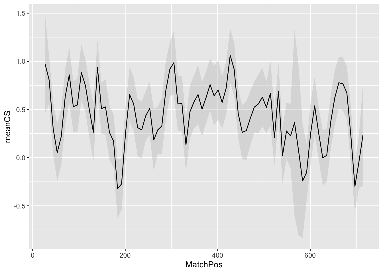
Then of course we can add the points, colored by their qtile scores
allGFP %>%
  filter(!is.na(meanCS)) %>%
  mutate(qtile = as.factor(ntile(meanCS, 4))) %>%
  ggplot(aes(x = MatchPos, y = meanCS, color = qtile)) +
  geom_smooth(method = "loess", span = 0.05, color = "black", size = 0.5, fill = "grey77") +
  geom_point(shape = 20)
## `geom_smooth()` using formula 'y ~ x'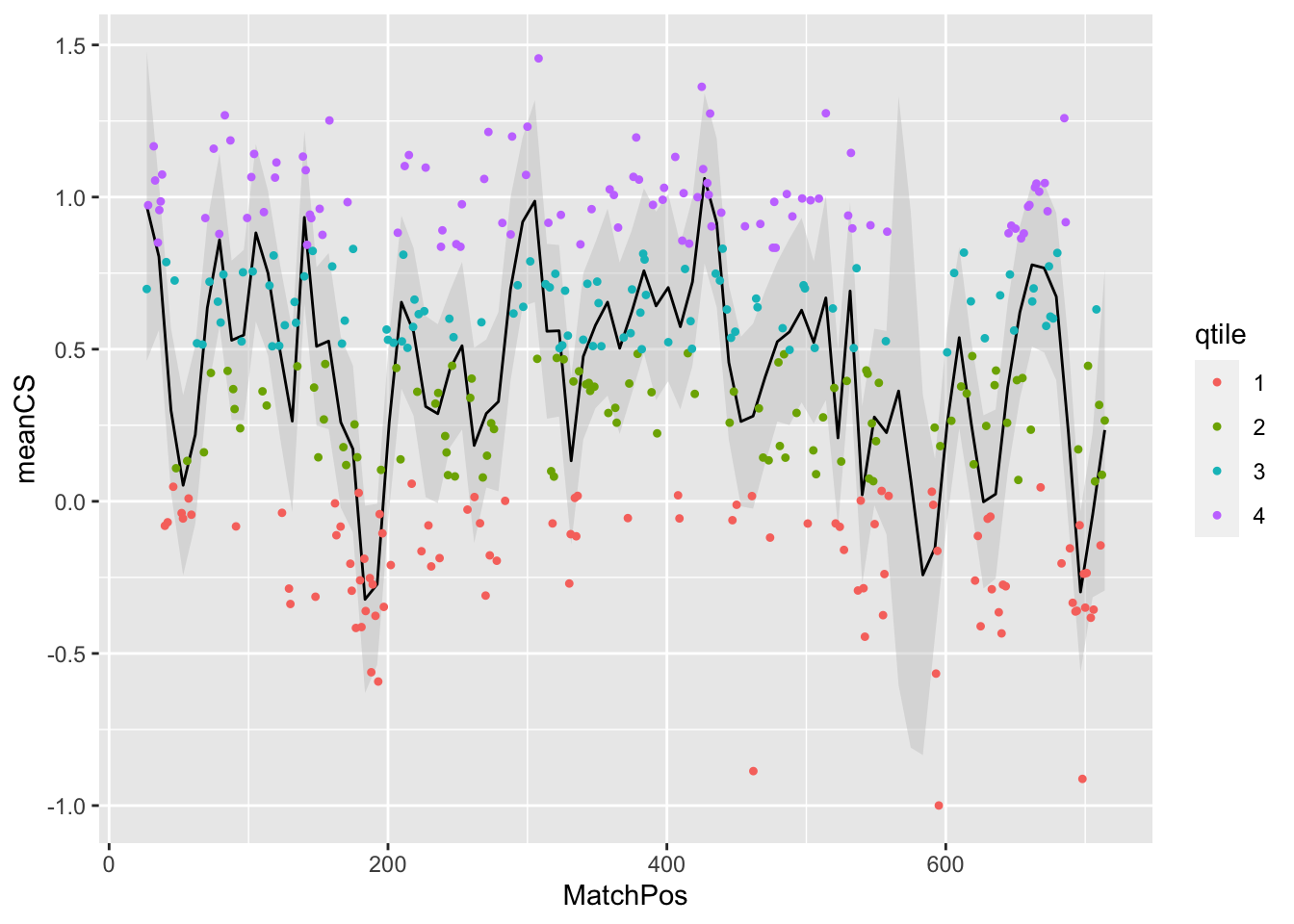
allGFP %>%
  filter(!is.na(meanCS)) %>%
  mutate(qtile = as.factor(ntile(meanCS, 4))) %>%
  ggplot(aes(x = MatchPos, y = meanCS, color = qtile)) +
  geom_smooth(method = "loess", span = 0.05, color = "black", size = 0.5, fill = "grey77") +
  geom_point(shape = 20) +
  # Use classic theme
  theme_classic() +
  # Remove color legend
  guides(color = "none") +
  # Set the ticks and limits of x and y axes
  scale_x_continuous(
    limits = c(-50, 750),
    breaks = seq(0, 750, 100),
  ) +
  scale_y_continuous(
    limits = c(-1, 1.5),
    breaks = seq(-1, 1.5, 1),
  ) +
  # Set axis titles
  xlab("Position in GFP transcript (nt)") +
  ylab("log2(FC)") +
  # Set aspect ratio
  coord_fixed(ratio = 200/3) +
  # Set a customized color palette
  scale_color_manual(values = gfp_color)
## `geom_smooth()` using formula 'y ~ x'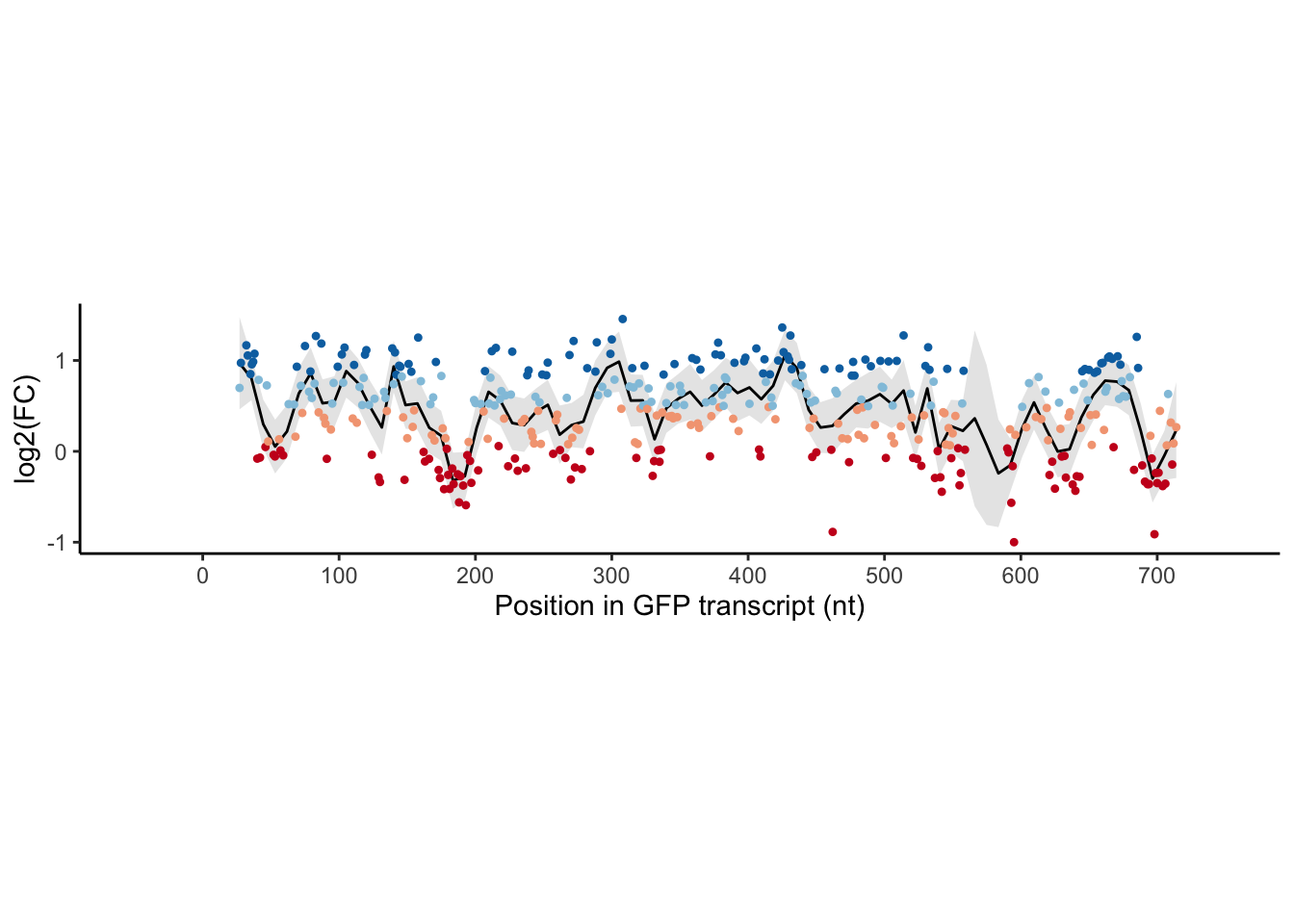
Many, many annotations are added here. This adds each individual box. Run the following code, and then try changing the Q1 box to say 1Q instead.
allGFP %>%
  filter(!is.na(meanCS)) %>%
  mutate(qtile = as.factor(ntile(meanCS, 4))) %>%
  ggplot(aes(x = MatchPos, y = meanCS, color = qtile)) +
  geom_smooth(method = "loess", span = 0.05, color = "black", size = 0.5, fill = "grey77") +
  geom_point(shape = 20) +
  # Use classic theme
  theme_classic() +
  # Remove color legend
  guides(color = "none") +
  # Set the ticks and limits of x and y axes
  scale_x_continuous(
    limits = c(-50, 750),
    breaks = seq(0, 750, 100),
  ) +
  scale_y_continuous(
    limits = c(-1, 1.5),
    breaks = seq(-1, 1.5, 1),
  ) +
  # Set axis titles
  xlab("Position in GFP transcript (nt)") +
  ylab("log2(FC)") +
  # Set aspect ratio
  coord_fixed(ratio = 200/3) +
  # Set a customized color palette
  scale_color_manual(values = gfp_color) +


  # Extra annotations -- these are done manually here.
  # The authors wrote a function for this, which is the preferred way:
  # https://gitlab.com/sanjanalab/cas13/-/blob/master/scripts/Plot_GuideScoreDistributionPerGene.R#L140
  # If you really want to fully recapitulate the figure, this is what you need.
  # But manually annotating one figure is pretty tedious as you see below.
  annotate(
    geom = "rect",
    # xmin and xmax (and x for the text geom should be computed as a function)
    # This is basically the length of each exons in the transcript
    xmin = 0,
    xmax = 750,
    # These are fixed for the transcript plot
    ymin = -1,
    ymax = -0.8,
    color = "grey50",
    fill = "lightblue",
    alpha = 0.5
  ) +
  annotate(
    # This labels the exon number
    geom = "text",
    x = 750/2,
    y = -0.9,
    label = "1",
    size = 2,
    color = "black"
  ) +
  annotate(
    # The following labels the range of each quartile
    geom = "rect",
    # The x range is fixed
    xmin = -50,
    xmax = -10,
    # ymin, ymax, and y for the text geom should be computed if a function
    # is to be written
    ymin = min(allGFP$meanCS, na.rm = TRUE),
    ymax = quantile(allGFP$meanCS, 0.25, na.rm = TRUE),
    fill = gfp_color[1],
    alpha = 0.3
  ) +
  annotate(
    geom = "text",
    x = -30,
    y =
      (min(allGFP$meanCS, na.rm = TRUE) + quantile(allGFP$meanCS, 0.25, na.rm = TRUE))/2,
    label = "Q1",
    size = 4
  ) +
  annotate(
    geom = "rect",
    xmin = -50,
    xmax = -10,
    ymin = quantile(allGFP$meanCS, 0.25, na.rm = TRUE),
    ymax = quantile(allGFP$meanCS, 0.5, na.rm = TRUE),
    fill = gfp_color[2],
    alpha = 0.3
  ) +
  annotate(
    geom = "text",
    x = -30,
    y =
      (quantile(allGFP$meanCS, 0.25, na.rm = TRUE) + quantile(allGFP$meanCS, 0.5, na.rm = TRUE))/2,
    label = "Q2",
    size = 4
  ) +
  annotate(
    geom = "rect",
    xmin = -50,
    xmax = -10,
    ymin = quantile(allGFP$meanCS, 0.5, na.rm = TRUE),
    ymax = quantile(allGFP$meanCS, 0.75, na.rm = TRUE),
    fill = gfp_color[3],
    alpha = 0.3
  ) +
  annotate(
    geom = "text",
    x = -30,
    y =
      (quantile(allGFP$meanCS, 0.5, na.rm = TRUE) + quantile(allGFP$meanCS, 0.75, na.rm = TRUE))/2,
    label = "Q3",
    size = 4
  ) +
  annotate(
    geom = "rect",
    xmin = -50,
    xmax = -10,
    ymin = quantile(allGFP$meanCS, 0.75, na.rm = TRUE),
    ymax = max(allGFP$meanCS, na.rm = TRUE),
    fill = gfp_color[4],
    alpha = 0.3
  ) +
  annotate(
    geom = "text",
    x = -30,
    y =
      (quantile(allGFP$meanCS, 0.75, na.rm = TRUE) + max(allGFP$meanCS, na.rm = TRUE))/2,
    label = "Q4",
    size = 4
  )
## `geom_smooth()` using formula 'y ~ x'