Pivoting and ggplot2
Function cheatsheet
Base R
mean()
sum()
head()
tail()
length()
dim()
as.numeric()
as.character()
typeof()
unique() - NEW - prints each categorical value only once (so the unique of c(1,2,2,4,5,5,5,8) would be 1,2,4,5,8)
Dplyr
filter()
group_by()
summarize()
na.omit()
mutate() - NEW - adds a new column based on the arguments within
transmute() - NEW - adds a new column based on the arguments within and then selects only that column
Ggplot2
ggplot()
aes()
geom_point()
geom_density()
geom_count()
geom_bar()
ggtitle()
xlab()
ylab()
geom_hline() - NEW - makes a horizontal line at the y intercept specified
geom_vline()- NEW - makes a vertical line at the x intercept specified
ylim() - NEW - takes in two numbers as the limits for the y axis
xlim() - NEW - takes in two numbers as the limits for the x axis
Advanced cheatsheets
Quick recap
penguins <- read.csv("penguins.csv")

#We can use dplyr's piping to filter by specific variables
penguins %>% filter(species == "Adelie") %>% head()
## species island bill_length_mm bill_depth_mm flipper_length_mm body_mass_g
## 1 Adelie Torgersen 39.1 18.7 181 3750
## 2 Adelie Torgersen 39.5 17.4 186 3800
## 3 Adelie Torgersen 40.3 18.0 195 3250
## 4 Adelie Torgersen NA NA NA NA
## 5 Adelie Torgersen 36.7 19.3 193 3450
## 6 Adelie Torgersen 39.3 20.6 190 3650
## sex year
## 1 male 2007
## 2 female 2007
## 3 female 2007
## 4 <NA> 2007
## 5 female 2007
## 6 male 2007penguins %>% filter(species == "Adelie") %>% ggplot(aes(x = sex)) + geom_bar()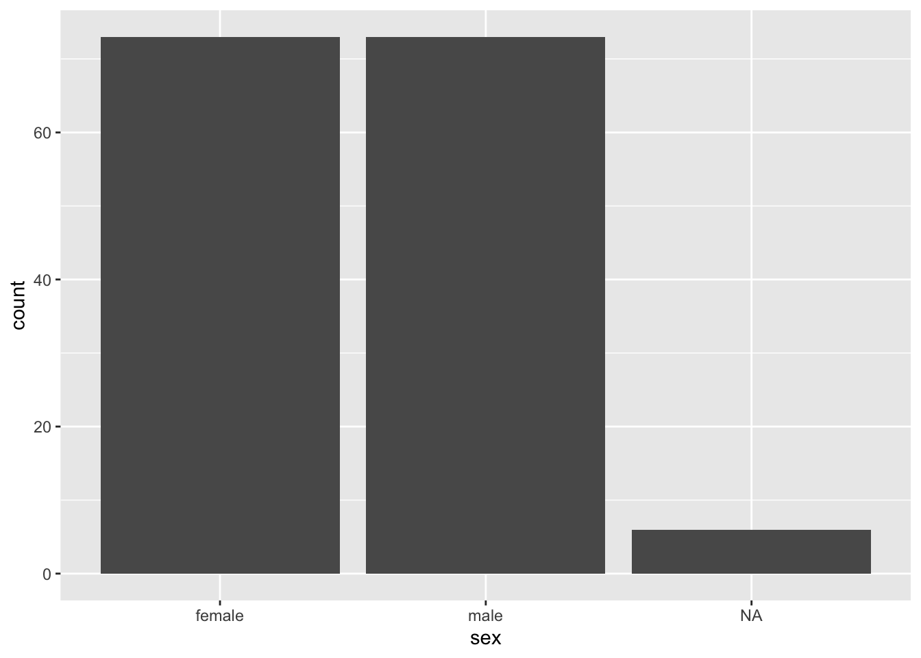
#We can also get summary statistics using summarize
penguins %>% na.omit() %>%
  group_by(species, sex) %>%
  summarize(bill_length_mean = mean(bill_length_mm))
## `summarise()` has grouped output by 'species'. You can override using the
## `.groups` argument.## # A tibble: 6 × 3
## # Groups: species [3]
## species sex bill_length_mean
## <chr> <chr> <dbl>
## 1 Adelie female 37.3
## 2 Adelie male 40.4
## 3 Chinstrap female 46.6
## 4 Chinstrap male 51.1
## 5 Gentoo female 45.6
## 6 Gentoo male 49.5#And then pipe this into a plot
penguins %>% na.omit() %>%
group_by(species, sex) %>%
summarize(bill_length_mean = mean(bill_length_mm)) %>%
ggplot(aes(x = sex, y = bill_length_mean, color = species)) +
geom_point()## `summarise()` has grouped output by 'species'. You can override using the
## `.groups` argument.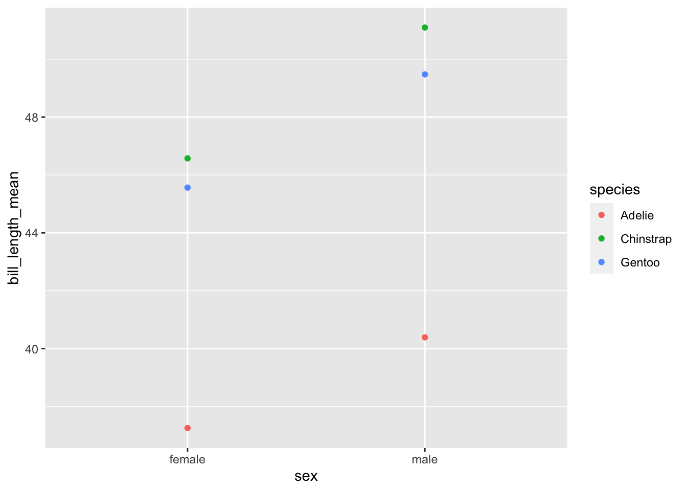
Review Practice
#### Practice dataset
# Load the Hollywood data
# Data courtesy: InformationIsBeautiful.net
# Data source: https://public.tableau.com/s/resources?qt-overview_resources=1#qt-overview_resources
hollywood = read.csv("hollywood.csv")

#### What is in the dataset? Use head() or str()

#### Piping into plots

hollywood %>%
## How do we remove rows with missing profitability or audience score?
  filter(!is.na(Profitability), !is.na(Audience_score)) %>%
## How do we keep only movies that are comedies
  filter(Genre == "Comedy") %>%
## How do we make a scatter plot that:
# 1. The x-axis is score on Rotten Tomatoes
# 2. The y-axis is how profitable a movie is
  ggplot(., aes(x = Audience_score, y = Profitability, color = Lead_Studio)) +
    geom_point()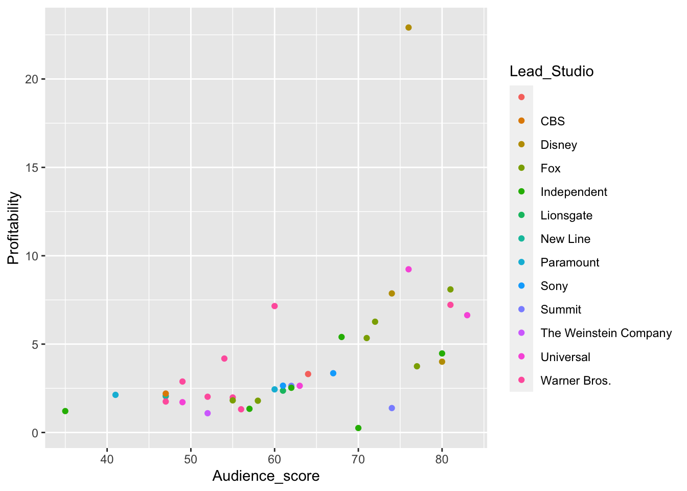
## Finally, how do we color each point by the lead studio that made the movieLine Plots
While scatter plot is very useful, line plot is sometimes useful to connect the
dots and represent a trend. In ggplot2, it is usually achieved with
geom_line().
# When you have many data, scatter plots can be difficult for finding trends
hollywood %>%
  na.omit() %>%
  ggplot(., aes(x = Year, y = Profitability, color = Genre)) +
  geom_jitter()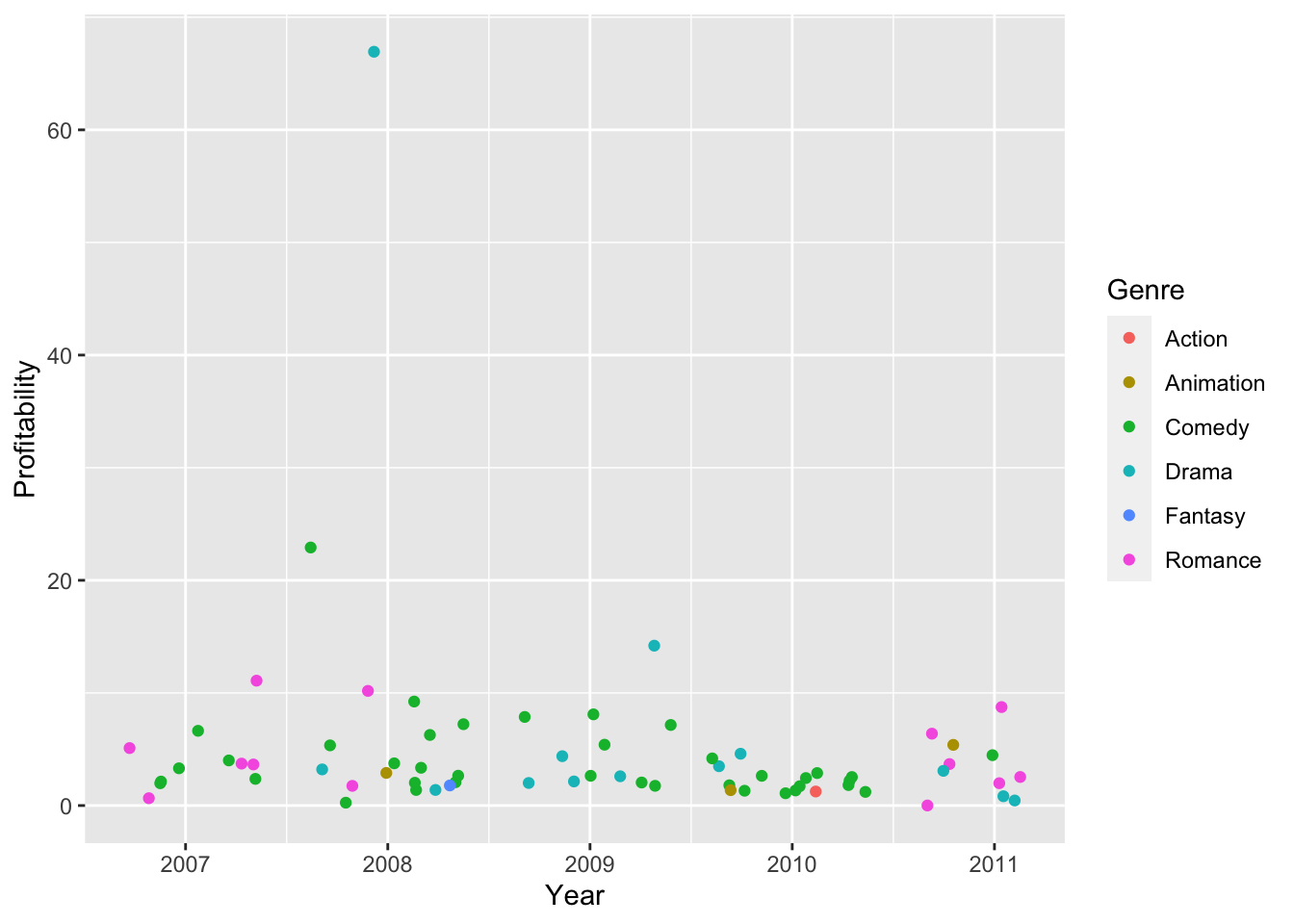
# Let's first get the average profitability per year per genre
hollywood %>%
  group_by(Genre, Year) %>%
# Since we are going to average, missing data will mess up the output.
# We are dropping them for the time being.
  na.omit() %>%
# Use summarize to get the average per group defined above
  summarize(avg_profit = mean(Profitability)) %>%
# Pipe the summary data frame to ggplot
  ggplot(., aes(x = Year, y = avg_profit, color = Genre)) +
  geom_line()
## `summarise()` has grouped output by 'Genre'. You can override using the
## `.groups` argument.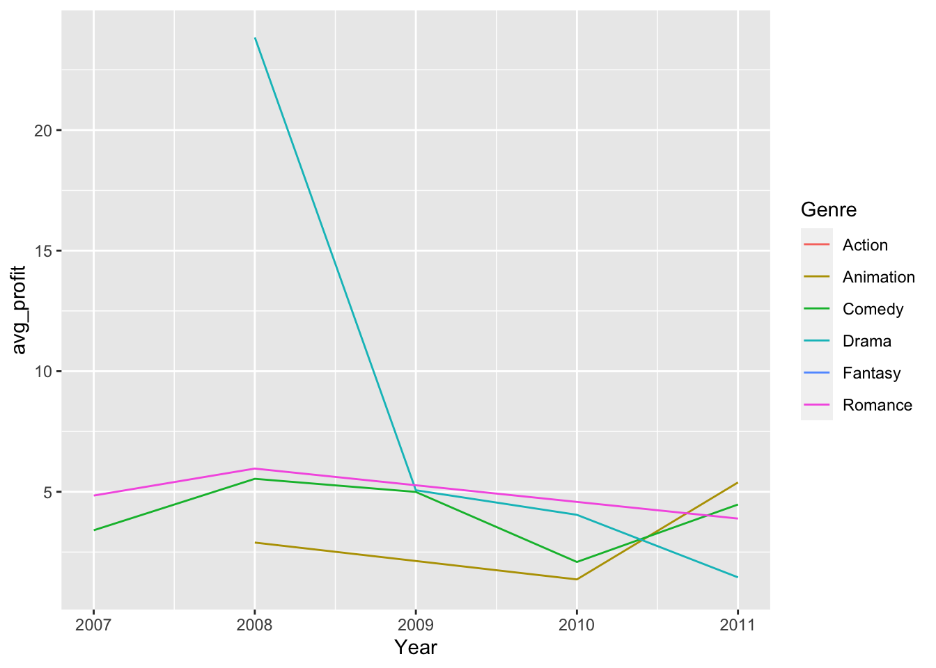
Pivoting using pivot_longer()
Oftentimes, we want to plot different data together in one plot (if they are on
a same scale). For example, check example_two_color.png in the folder. How
would you make a plot like this?

One (hopefully) straightforward way of making this kind of plot is to have
a column that contains the kind of scores, so you can do something like
aes(color = kind_of_score), while at the same time have another column that
keeps both the score from audiences and from Rotten Tomatoes to allow
aes(x = review_score).
tidyr provides a simple way to do this. The function that does this is
pivot_longer(), and the minimal thing that you need to know before using it
is which columns contain the scores that you want to store into the same column.
# Examine the original data.frame
head(hollywood)
## Film Genre Lead_Studio Audience_score Profitability
## 1 27 Dresses Comedy Fox 71 5.3436218
## 2 (500) Days of Summer Comedy Fox 81 8.0960000
## 3 A Dangerous Method Drama Independent 89 0.4486447
## 4 A Serious Man Drama Universal 64 4.3828571
## 5 Across the Universe Romance Independent 84 0.6526032
## 6 Beginners Comedy Independent 80 4.4718750
## Rotten_Tomatoes Worldwide_Gross Year
## 1 40 160.308654 2008
## 2 87 60.720000 2009
## 3 79 8.972895 2011
## 4 89 30.680000 2009
## 5 54 29.367143 2007
## 6 84 14.310000 2011# Say we want to store audience_score and rotten_tomatoes into the same column
# assign the new data.frame into another object to make comparison easier
long_hollywood = hollywood %>%
pivot_longer(cols = c(Audience_score, Rotten_Tomatoes))
head(long_hollywood)## # A tibble: 6 × 8
## Film Genre Lead_Studio Profitability Worldwide_Gross Year name value
## <chr> <chr> <chr> <dbl> <dbl> <int> <chr> <int>
## 1 27 Dresses Come… Fox 5.34 160. 2008 Audi… 71
## 2 27 Dresses Come… Fox 5.34 160. 2008 Rott… 40
## 3 (500) Days … Come… Fox 8.10 60.7 2009 Audi… 81
## 4 (500) Days … Come… Fox 8.10 60.7 2009 Rott… 87
## 5 A Dangerous… Drama Independent 0.449 8.97 2011 Audi… 89
## 6 A Dangerous… Drama Independent 0.449 8.97 2011 Rott… 79Do you still see either Audience_score or Rotten_Tomatoes?
Sometimes, naming columns name and value could be confusing for the future
you, and you are likely to be able to come up with better names.
pivot_longer() provides such arguments, so let’s ?pivot_longer or
help(pivot_longer) and find out which arguments provide this function.
# Let's name the score column "score"
# while the source of review column "score_type"
long_hollywood = hollywood %>%
  pivot_longer(
    cols = c(Audience_score, Rotten_Tomatoes), names_to = "score_type", values_to = "score"
  )

head(long_hollywood)
## # A tibble: 6 × 8
## Film Genre Lead_Studio Profitability Worldwide_Gross Year score_type score
## <chr> <chr> <chr> <dbl> <dbl> <int> <chr> <int>
## 1 27 Dre… Come… Fox 5.34 160. 2008 Audience_… 71
## 2 27 Dre… Come… Fox 5.34 160. 2008 Rotten_To… 40
## 3 (500) … Come… Fox 8.10 60.7 2009 Audience_… 81
## 4 (500) … Come… Fox 8.10 60.7 2009 Rotten_To… 87
## 5 A Dang… Drama Independent 0.449 8.97 2011 Audience_… 89
## 6 A Dang… Drama Independent 0.449 8.97 2011 Rotten_To… 79Practice
You will find in the folder rnaseq_for_heatmap.csv.
With your partner,
Examine what the data is about: What is each row and column?
Use
pivot_longer()to store the z-scores of every gene in a column, and the gene symbols in another.Let’s name the value column
z_scoreand the name columngene.
Assign the pivoted data.frame to a new object.
rnaseq = read.csv("rnaseq_for_heatmap.csv")

# You don't really want to pivot the sample column, so please set
# cols = -sample. This would pivot all other columns except for sample.
rnaseq_plot = rnaseq %>%
  pivot_longer(
    cols = -sample,
    names_to = "gene",
    values_to = "z_score"
  )

head(rnaseq_plot)
## # A tibble: 6 × 3
## sample gene z_score
## <chr> <chr> <dbl>
## 1 A_Brachial Aldh1a2 0.0398
## 2 A_Brachial Runx1 0.112
## 3 A_Brachial Tacr3 0.666
## 4 A_Brachial Etv4 0.222
## 5 A_Brachial Dio3 0.759
## 6 A_Brachial Smug1 0.827Heatmaps
Another popular visualization to show differences and trend is heatmaps. In a heatmap, every data point is presented as a block, and the value to be compared is represented by the color of the block.
This can be done with geom_tile()
# Say we want to see if the average z-score for each chromosome
# for both bulk and parent
# We can first group by chromosomes and sample type
rnaseq_plot %>%
  ggplot(., aes(x = sample, y = gene, fill = z_score)) +
  geom_tile()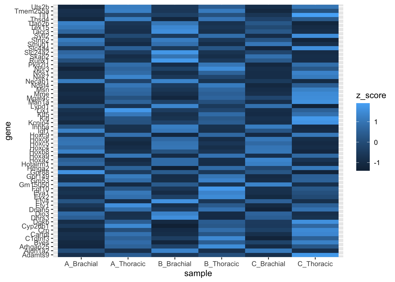
You might find the default ggplot2 coloring less than ideal. If that’s the case,
you can turn to scale_* family of functions.
In our case, we want to change a gradient that is used to fill, so the function
would be scale_fill_gradient().
The function takes two colors, low and high. You can refer to colors by
their names or by hex codes.
You can find a list of named colors in R here.
rnaseq_plot %>%
  ggplot(., aes(x = sample, y = gene, fill = z_score)) +
  geom_tile() +
  scale_fill_gradient(low = "green", high = "magenta")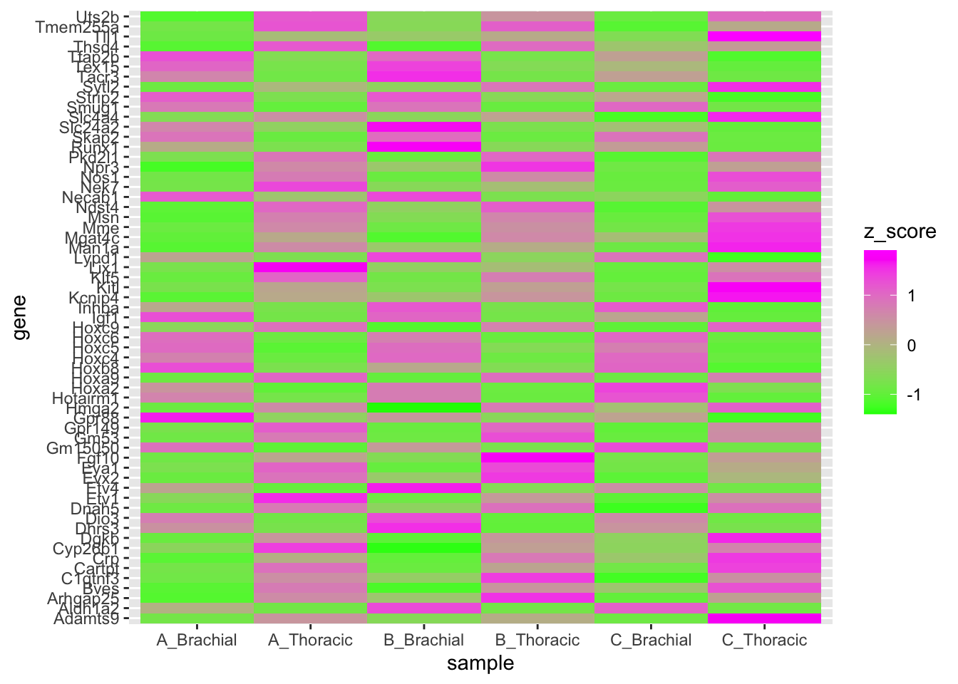
Factors
This RNA-Seq dataset is originally from Figure 5B of this article, but it currently looks very messy and different from the figure. What is happening?

# The row order that is defined in a data.frame
fruits = data.frame(
  type = c("banana", "apple", "citrus"),
  price = c(5, 1, 3)
)

# Will not be respected even in a very simple plot
# Check the x-axis -- it's alphabetically ordered
fruits %>% qplot(data = ., x = type, y = price)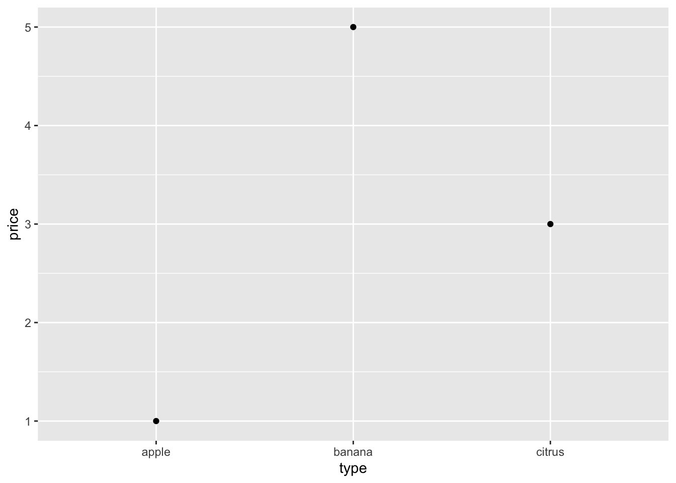
To tell ggplot2 the order we want, we must let it know its a categorical
variable with an order. This is called a factor in R.
# We can make a factor from a character vector using factor().
fruits$factor_type = factor(
  # Give it the vector you want to convert
  x = fruits$type,
  # A level is a category
  # the order you used for levels will be honored by ggplot2
  levels = c("banana", "apple", "citrus")
)

# Let's try the same plot again
fruits %>% qplot(data = ., x = factor_type, y = price)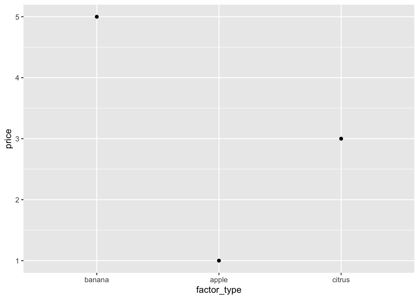
Practice: Ordering gene symbols with factors
We can do the same for the gene column in rnaseq_plot. You can find a list
of genes in the folder in gene_order.txt. Let’s load it into R with
readLines(), which would load every line of the file as an element of a
vector.
# Load gene list
gene_order = readLines("gene_order.txt")
Then, we are going to make rnaseq_plot$gene a factor, and use the order of
genes we just loaded above to define its levels.
# Use factor() to convert rnaseq_plot$gene into a factor
# define the order with gene_order (loaded above)
# and assign it into a new column (gene_ordered)
rnaseq_plot$gene_ordered = factor(
  x = rnaseq_plot$gene,
  levels = gene_order
)
Now that the genes are ordered as the article, let’s plot the heatmap again.
This time, use gene_ordered instead of gene as the y-axis.
rnaseq_plot %>%
  ggplot(., aes(x = sample, y = gene_ordered, fill = z_score)) +
  geom_tile() +
  scale_fill_gradient(low = "green", high = "magenta")
Practice Exercises
Today we’re going to use one of Cassandra’s data sets, which has chromosome positions and z-scores.
BSAResults = read.csv("BSAResults.csv")

# Filter for Chromosome II using dplyr's filter() function

BSAResults %>% filter(CHROM == "II") %>% head()
## X CHROM POS Bulk Parent Interaction
## 1 result.11000 II 100153 -0.18330726 -0.06467321 0.19943965
## 2 result.21000 II 100367 -0.18800155 -0.29128447 0.28590390
## 3 result.31000 II 100413 -0.32764216 -0.30312559 0.52362311
## 4 result.41000 II 100878 0.02040887 0.11852673 -0.16398910
## 5 result.51000 II 101103 -0.13385976 -0.01003441 -0.01602947
## 6 result.6432 II 101289 -0.25282081 0.08171578 0.21342401# Plot a scatter plot of the Bulk with x-axis being POS and y-axis being Bulk values
BSAResults %>% filter(CHROM == "II") %>% ggplot(., aes(x = POS, y = Bulk)) + geom_point()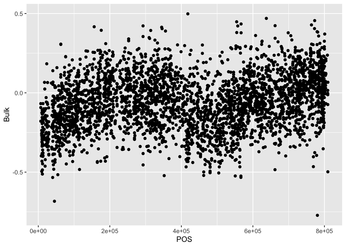
# If we want plot Bulk, Interaction, and Parent for Chr II at once, we need to pivot the data to long format. How do we do so?

BSAResults %>% filter(CHROM == "II") %>% pivot_longer(c("Bulk", "Parent", "Interaction"))
## # A tibble: 10,710 × 5
## X CHROM POS name value
## <chr> <chr> <dbl> <chr> <dbl>
## 1 result.11000 II 100153 Bulk -0.183
## 2 result.11000 II 100153 Parent -0.0647
## 3 result.11000 II 100153 Interaction 0.199
## 4 result.21000 II 100367 Bulk -0.188
## 5 result.21000 II 100367 Parent -0.291
## 6 result.21000 II 100367 Interaction 0.286
## 7 result.31000 II 100413 Bulk -0.328
## 8 result.31000 II 100413 Parent -0.303
## 9 result.31000 II 100413 Interaction 0.524
## 10 result.41000 II 100878 Bulk 0.0204
## # … with 10,700 more rows# Then to plot, we can separate our data by "name"
BSAResults %>% filter(CHROM == "II") %>% pivot_longer(c("Bulk", "Parent", "Interaction")) %>% ggplot(aes(x = POS, y = value, color = name)) + geom_point()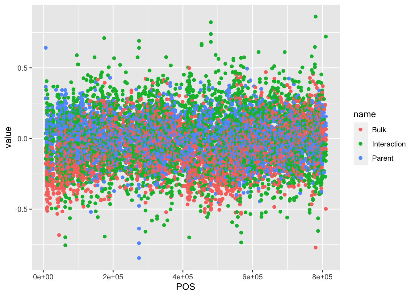
# There's a more interesting thing happening on Chr VIII. Filter for this next

BSAResults %>% filter(CHROM == "VIII") %>% pivot_longer(c("Bulk", "Parent", "Interaction")) %>% ggplot(aes(x = POS, y = value, color = name)) + geom_point()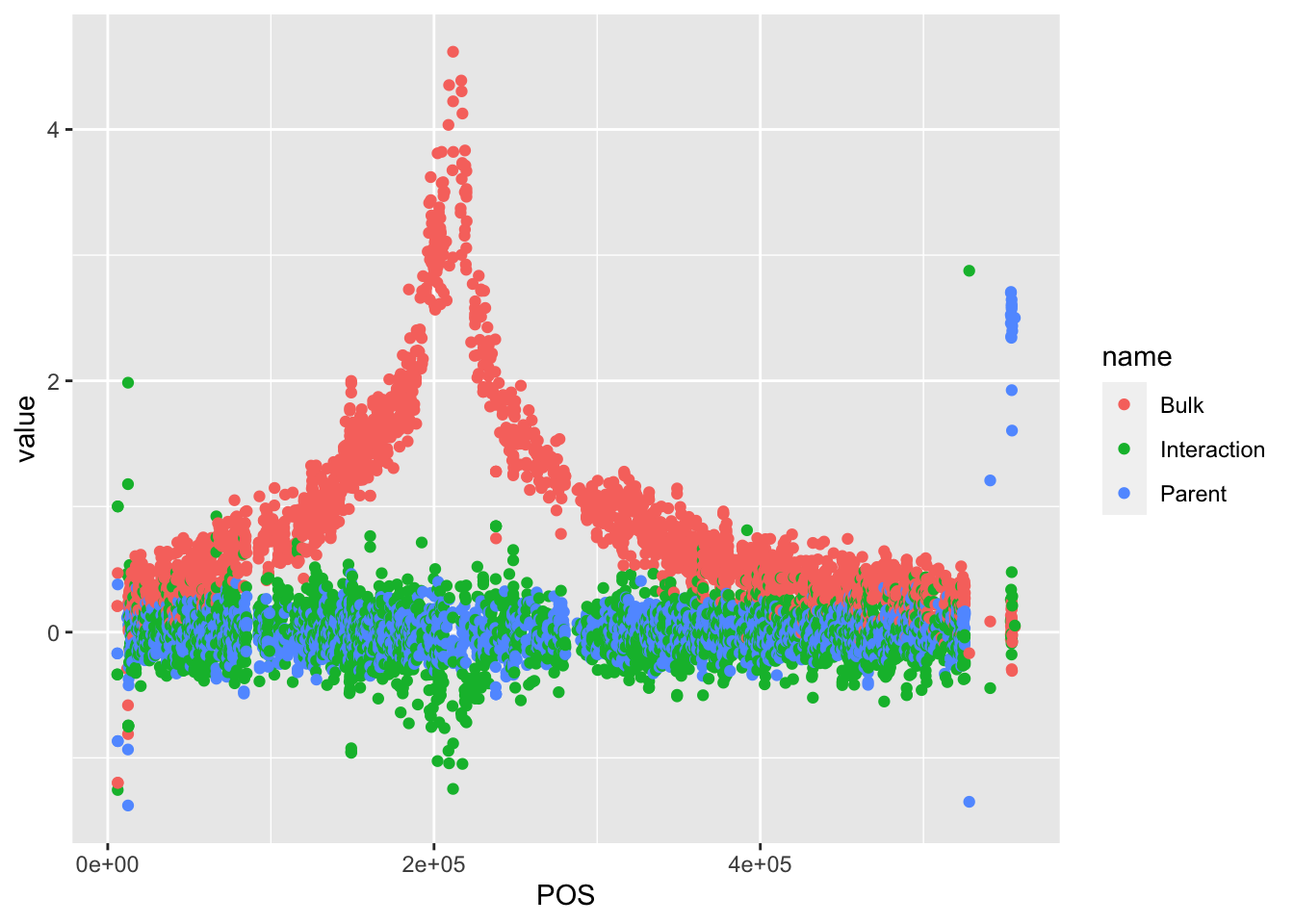
#There are a lot of points. Change the opacity of these points

BSAResults %>% filter(CHROM == "VIII") %>% pivot_longer(c("Bulk", "Parent", "Interaction")) %>% ggplot(aes(x = POS, y = value, color = name)) + geom_point(alpha = 0.5)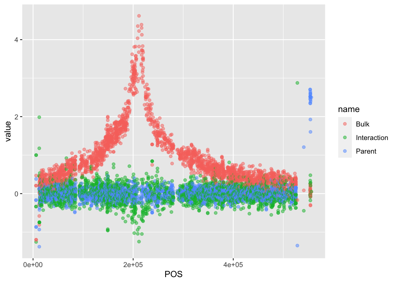
# We now want to change the names to reflect what the value actually is. Add labels to the plot

BSAResults %>% filter(CHROM == "VIII") %>% pivot_longer(c("Bulk", "Parent", "Interaction")) %>% ggplot(aes(x = POS, y = value, color = name)) + geom_point(alpha = 0.5) + ggtitle("Effects of GLM") + ylab("Z score") + xlab("Position")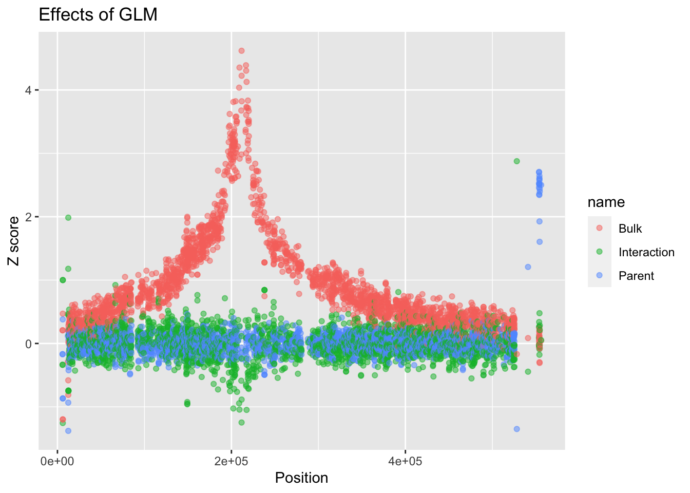
# A different theme might be better. Let's use theme_classic()

BSAResults %>% filter(CHROM == "VIII") %>% pivot_longer(c("Bulk", "Parent", "Interaction")) %>% ggplot(aes(x = POS, y = value, color = name)) + geom_point(alpha = 0.5) + ggtitle("Effects of GLM") + ylab("Z score") + xlab("Position") + theme_classic()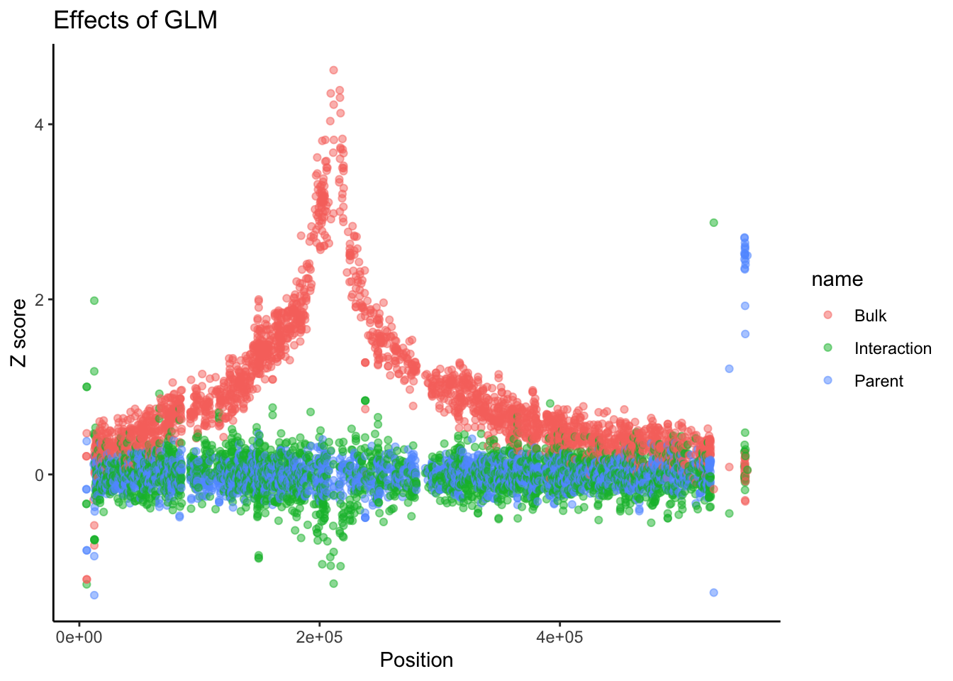
# Faceting

BSAResults %>% pivot_longer(c("Bulk", "Parent", "Interaction")) %>% ggplot(aes(x = POS, y = value, color = name)) + geom_point(alpha = 0.5) + ggtitle("Effects of GLM") + ylab("Z score") + xlab("Position") + facet_grid(~CHROM)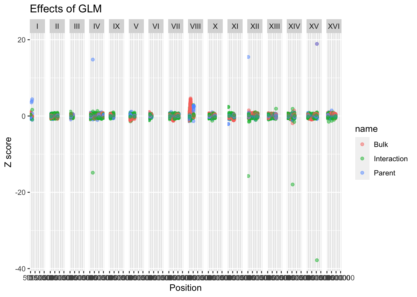
#There are some weird values, but because these are z-scores, we know most of the data should be within +/- 2 unless significat. We can change our limits to reflect this and see actual trends

BSAResults %>% pivot_longer(c("Bulk", "Parent", "Interaction")) %>% ggplot(aes(x = POS, y = value, color = name)) + geom_line(alpha = 0.5) + ggtitle("Effects of GLM") + ylab("Z score") + xlab("Position")+ ylim(-5,5) + facet_grid(~CHROM, scales = "free", space = "free_x")
Coming up: Sanjana Lab Data
Yen-Chung Chen
PhD Candidate
A graduate student interested in developmental biology, neurobiology and bioinformatics.