Introduction to ggplot2
Review
A quick review before we get into more complicated exercises:
#We can create a data frame using the c() function

myplants <- data.frame(Plants = c("Aloe", "Pothos", "Spider", "ZZ", "Snake",
                                "Aloe", "Pothos", "Spider", "ZZ", "Snake"),
                     Growth = c(1.2, 2.2, 3.1, 1.4, 5.7, 3.4, 1.9, 2.5, 1.2, 5.3),
                     Water = c(1,1,1,1,1,2,2,2,2,2))

#View Data using head() or str()
head(myplants)
## Plants Growth Water
## 1 Aloe 1.2 1
## 2 Pothos 2.2 1
## 3 Spider 3.1 1
## 4 ZZ 1.4 1
## 5 Snake 5.7 1
## 6 Aloe 3.4 2#We can use square brackets and $ to select columns and rows of a data frame
myplants[myplants$Growth > 2,]## Plants Growth Water
## 2 Pothos 2.2 1
## 3 Spider 3.1 1
## 5 Snake 5.7 1
## 6 Aloe 3.4 2
## 8 Spider 2.5 2
## 10 Snake 5.3 2#We can use dplyr to filter for this same Growth
myplants %>% filter(Growth > 2)## Plants Growth Water
## 1 Pothos 2.2 1
## 2 Spider 3.1 1
## 3 Snake 5.7 1
## 4 Aloe 3.4 2
## 5 Spider 2.5 2
## 6 Snake 5.3 2#If we wanted to count how many elements in a vector satisfy this,
#we could sum a logical. First print the logical, then find the sum
# myplants$Growth > 2
sum(myplants$Growth > 2)## [1] 6#Using dplyr, we could use the count() function to find this same thing
myplants %>% count(Growth > 2)## Growth > 2 n
## 1 FALSE 4
## 2 TRUE 6myplants %>% filter(Growth > 2) %>% count()## n
## 1 6#If we wanted to make a new data frame for just the Pothos plants,
# we could assign using the '<-' sign
pothos_plants <- myplants[myplants$Plants == "Pothos",]
# Finally, if we wanted to use the qplot function to plot the data, we could do
# so as follows:
qplot(Plants, Growth, data = myplants, color = Water, size = I(5))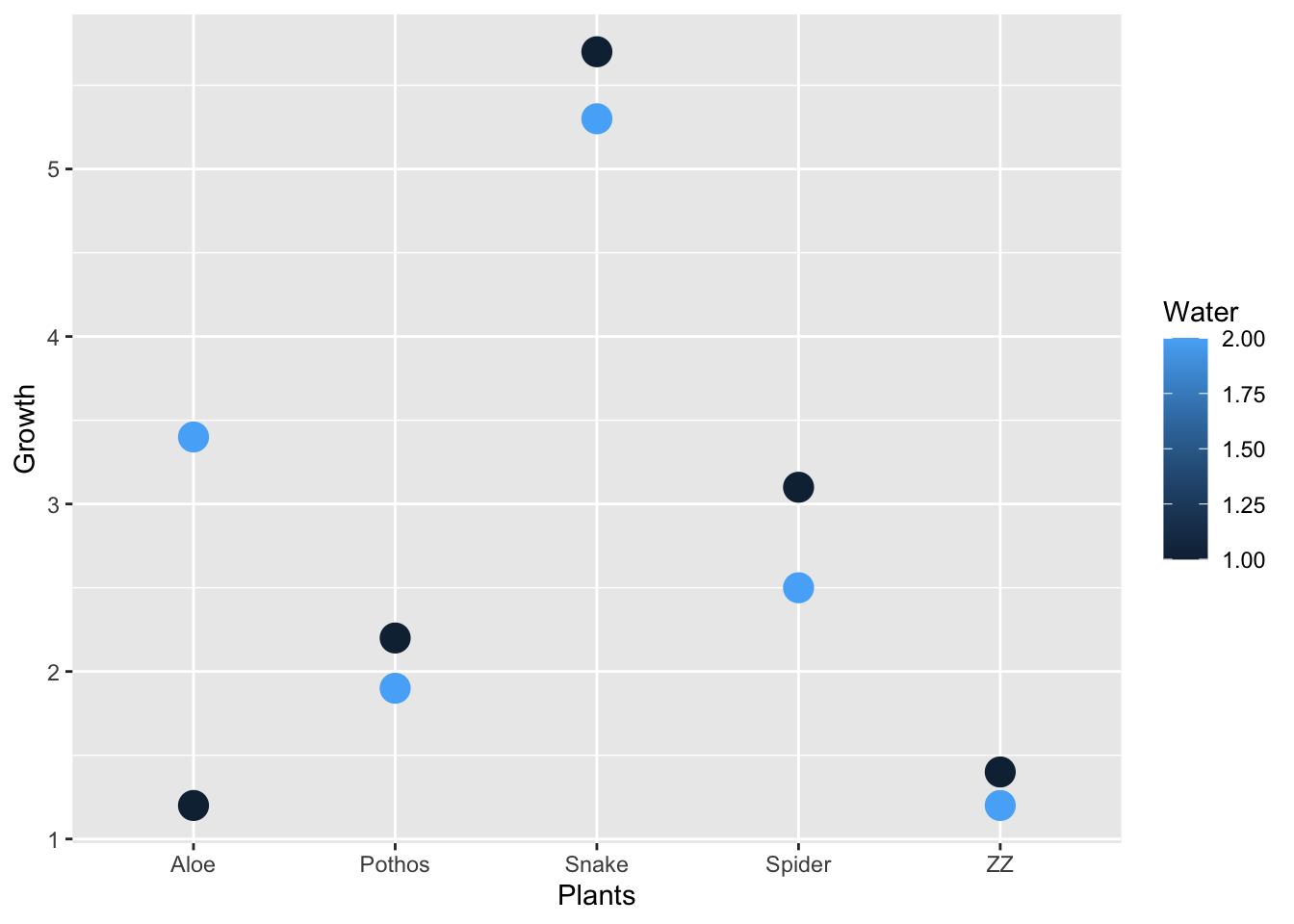
Work in pairs. Let’s answer a few questions to remind ourselves how functions, indexing, and dplyr all work:
#Load in the dplyr library if you haven't already
library(dplyr)

#Read in your penguins dataset
penguins = read.csv("penguins.csv")

#Using square brackets, make a new data frame for female Adelie penguins
adelie_f = filter(penguins, sex == "Female", species == "Adelie")

#Using dplyr, count how many Adelie female penguins are in each island
adelie_f %>% count(island)
## [1] island n
## <0 rows> (or 0-length row.names)#Using dplyr, make another data frame for male Gentoo penguins
gentoo_m = filter(penguins, sex == "Male", species == "Gentoo")
#Without using dplyr, count how many Gentoo male penguins are on
#the island Biscoe
sum(gentoo_m$island == "Biscoe")## [1] 0Ggplot2: Grammar of Graphics
This package ggplot2 provides a base plotting function (qplot) as well as the function ggplot() to take in data and many (many) geoms to specify the plot. We’ve only used qplot, or quickplot, up until this point, but as your analysis becomes more specific and you start to tell the story of your data, you’ll want to customize.
Scatter Plots using geom_point()
Let’s start with a scatter plot, since this is the default for qplot() with two axes.
ggplot(data = penguins, aes(x = bill_length_mm, y = flipper_length_mm)) +
  geom_point()
## Warning: Removed 2 rows containing missing values (geom_point).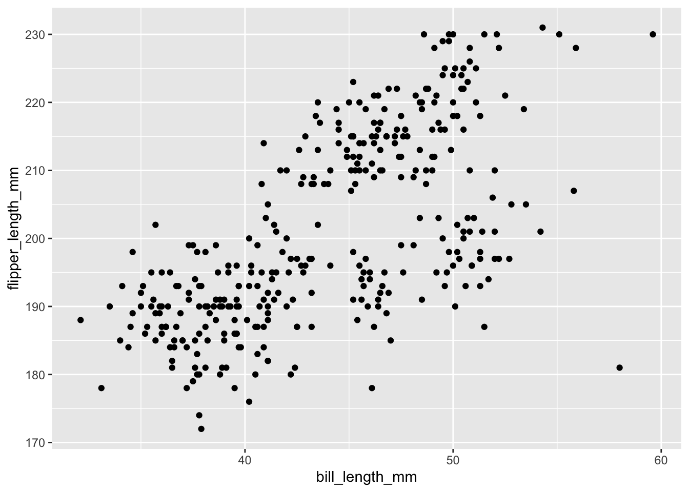
ggplot(
  data = penguins,
  aes(x = bill_length_mm, y = flipper_length_mm, color = species)
) +
  geom_point()
## Warning: Removed 2 rows containing missing values (geom_point).
Practice
#Try plotting the flipper length and body mass using geom_point(),
# and then coloring points by sex
penguins %>%
  ggplot(data = ., aes(x = flipper_length_mm, y = body_mass_g, color = sex)) +
  geom_point()
## Warning: Removed 2 rows containing missing values (geom_point).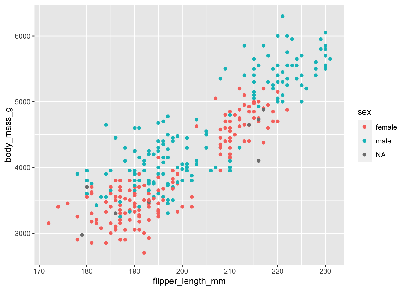
There are several other options for a ggplot that can be added in using ‘+’. These include ggtitle, xlim and ylim, labels, and themes. Below we’ll add a title and change the x and y axis labels.
#First, we can look up one of the functions within ggplot2 called ggtitle,
#which will have our labeling functions. Because these are each their own
#function, we won't get the information from the help menu of ggplot() on its
#own, but this is where Googling the usage would be beneficial.

?ggtitle
#Next let's add these labels to our plot. Notice that each line ends in a '+'
ggplot(
data = penguins,
aes(x = bill_length_mm, y = flipper_length_mm, color = species)
) +
geom_point() +
ggtitle("Penguin Bill vs Flipper Length") +
xlab("Bill Length (mm)") +
ylab("Flipper Length (mm)")## Warning: Removed 2 rows containing missing values (geom_point).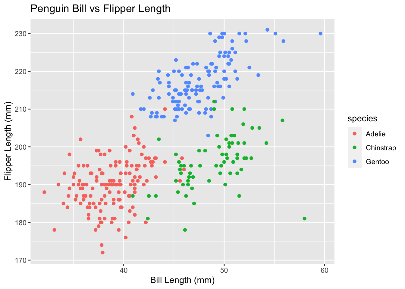
Changing alpha and size
Notice that the aes() argument gives us the columns that we’re using in our plot, and that we don’t have anything yet inside the function of geom_point(). Let’s look at the documentation for geom_point() to see our options.
#How do we find the help menu?
help(geom_point)
#Scroll down to the "Aesthetics" section; what do you find?

#Scroll down to the "Examples" section - how would you set your aesthetics to a fixed value?
If we don’t specify a column for the aesthetics within geom_point(), we can set them to a fixed value. This will help us change the shape, size, color, and alpha of our plot.
#Changing the size to larger
ggplot(
  data = penguins, aes(x = bill_length_mm, y = flipper_length_mm, color = species)
) +
  geom_point(size = 4)
## Warning: Removed 2 rows containing missing values (geom_point).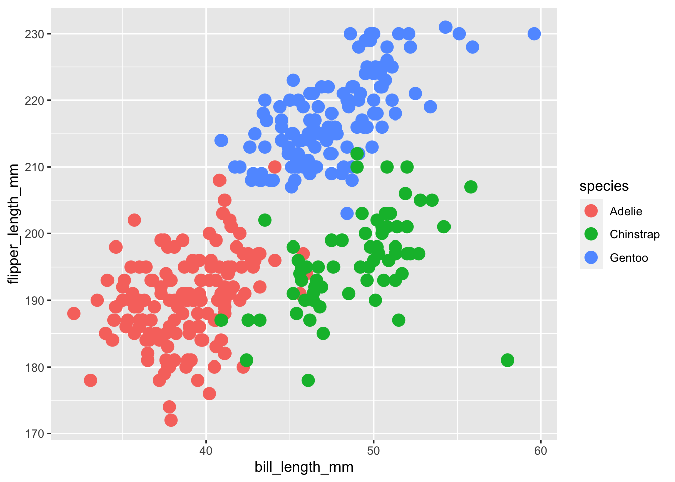
#Changing the transparency (alpha) to lighter
ggplot(
  data = penguins, aes(x = bill_length_mm, y = flipper_length_mm, color = species)
) +
  geom_point(alpha = 0.5)
## Warning: Removed 2 rows containing missing values (geom_point).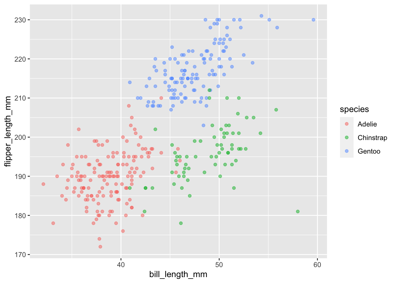
We can combine both of these values to make larger more transparent points on our plot by separating arguments with a comma. We can also change the shape.
ggplot(
  data = penguins,
  aes(x = bill_length_mm, y = flipper_length_mm, color = species)
) +
  geom_point(size = 4, alpha = 0.5)
## Warning: Removed 2 rows containing missing values (geom_point).
If we wanted all of the points to be the same color, not based on a variable, we would put this argument in the geom_point() function rather than inside aes().
ggplot(
  data = penguins,
  aes(x = bill_length_mm, y = flipper_length_mm)
) +
  geom_point(size = 4, alpha = 0.5, color = "red")
## Warning: Removed 2 rows containing missing values (geom_point).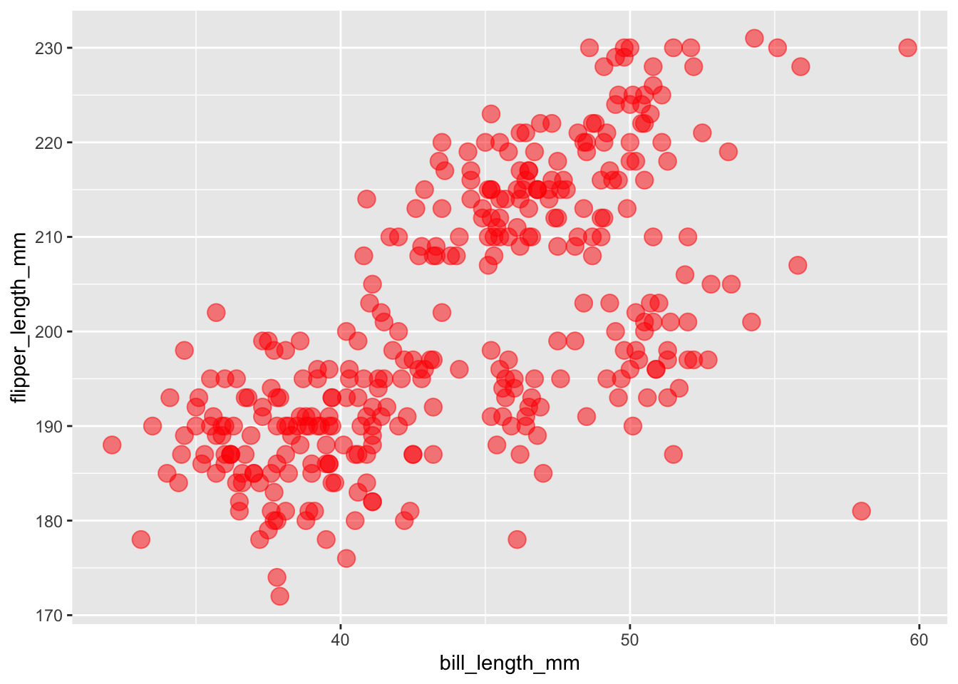
If we wanted to change the shape of our points by our species column, how would we do this?
# CHANGE THE FOLLOWING CODE to make **shape** rather than **color** vary by species.

ggplot(
  data = penguins,
  aes(x = bill_length_mm, y = flipper_length_mm, color = species)
) +
  geom_point(size = 4,alpha = 0.5)
## Warning: Removed 2 rows containing missing values (geom_point).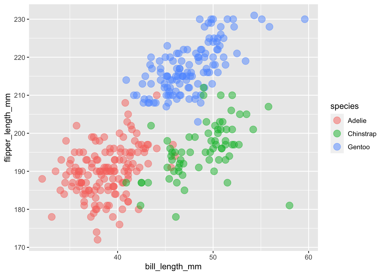
Density Plots using geom_density()
Let’s say that instead of a scatter plot, you wanted to know the distributions of your numeric data. In this case, you could use the geom_density() function to plot this, but your arguments would be different since the default for your y axis will be density.
#First define your data, then aesthetics (aes),
# and finally add on your geom at the end
ggplot(data = penguins, aes(x = flipper_length_mm, color = species)) + geom_density()
## Warning: Removed 2 rows containing non-finite values (stat_density).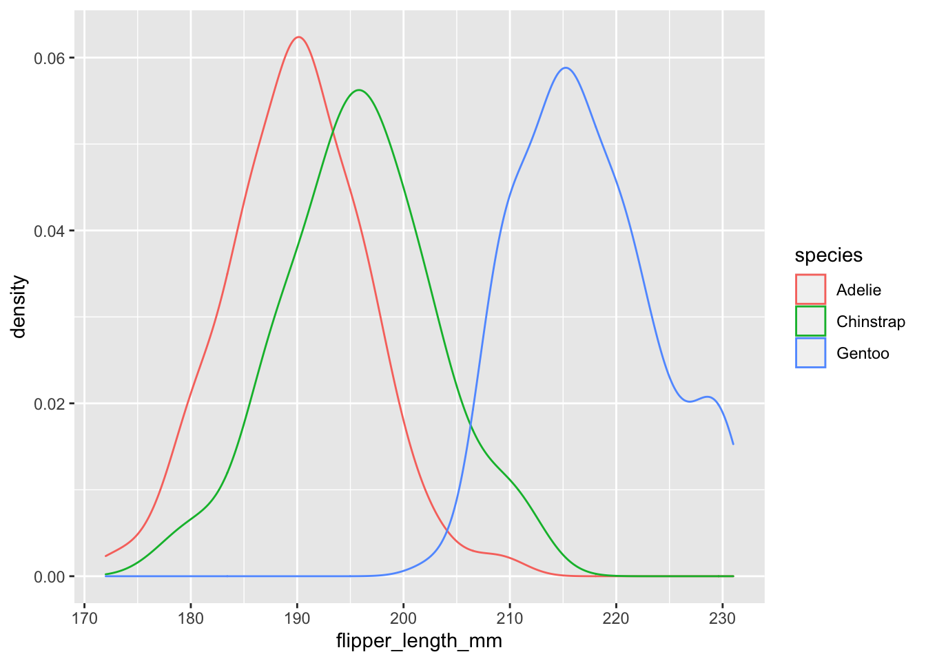
Practice
#On your own, add the title and x and y labels to your density plot.
ggplot(data = penguins, aes(x = flipper_length_mm, color = species)) +
  geom_density() +
  labs(title = "Numeric data", x = "Flipper Length (mm)", y = "Density")
## Warning: Removed 2 rows containing non-finite values (stat_density).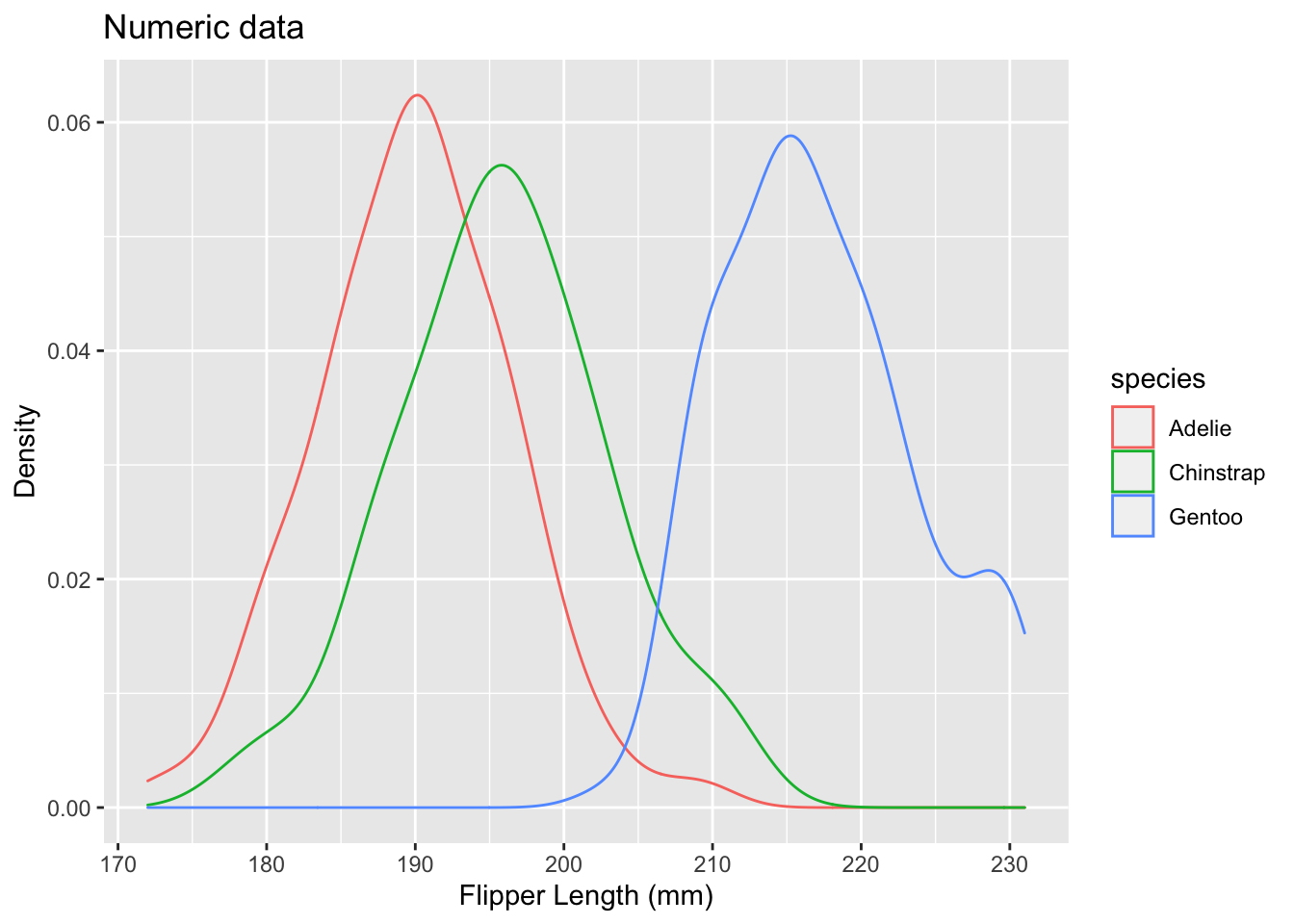
# Next, see what the "size" function does if you add that to geom_density().
# Set the size to 2.
ggplot(data = penguins, aes(x = flipper_length_mm, color = species)) +
  geom_density(size = 2) +
  labs(title = "Numeric data", x = "Flipper Length (mm)", y = "Density")
## Warning: Removed 2 rows containing non-finite values (stat_density).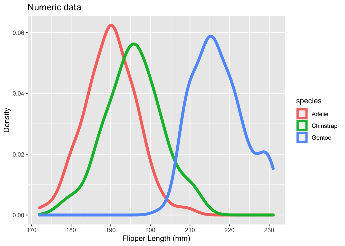
Let’s instead use “fill” instead of “color” for our density plot.
# Notice that the argument after x is fill, rather than color
# (which we've used before)

ggplot(data = penguins, aes(x = flipper_length_mm, fill = species)) + geom_density()
## Warning: Removed 2 rows containing non-finite values (stat_density).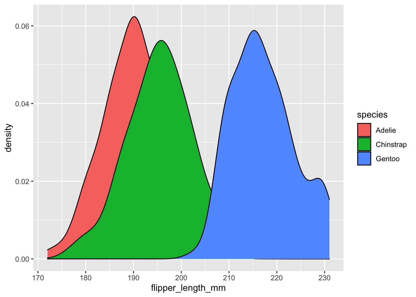
Next, let’s add transparency. What would we change about the following code to do this?
#Once again, we can change the transparency of our plot

ggplot(data = penguins, aes(x = flipper_length_mm, fill = species)) + geom_density()
Practice Exercise
With a partner, let’s make a scatter plot and two density plots of two numeric variables; make one scatter plot looking at the correlation between the two, and then a density plot for each variable that you choose. Color based on a categorical variable.
#Use head() or str() to find the variables that are numeric
str(penguins)
## 'data.frame': 344 obs. of 8 variables:
## $ species : chr "Adelie" "Adelie" "Adelie" "Adelie" ...
## $ island : chr "Torgersen" "Torgersen" "Torgersen" "Torgersen" ...
## $ bill_length_mm : num 39.1 39.5 40.3 NA 36.7 39.3 38.9 39.2 34.1 42 ...
## $ bill_depth_mm : num 18.7 17.4 18 NA 19.3 20.6 17.8 19.6 18.1 20.2 ...
## $ flipper_length_mm: int 181 186 195 NA 193 190 181 195 193 190 ...
## $ body_mass_g : int 3750 3800 3250 NA 3450 3650 3625 4675 3475 4250 ...
## $ sex : chr "male" "female" "female" NA ...
## $ year : int 2007 2007 2007 2007 2007 2007 2007 2007 2007 2007 ...#Make a scatter plot of the two variables using geom_point()
penguins %>%
ggplot(data = ., aes(x = bill_length_mm, y = bill_depth_mm)) +
geom_point()## Warning: Removed 2 rows containing missing values (geom_point).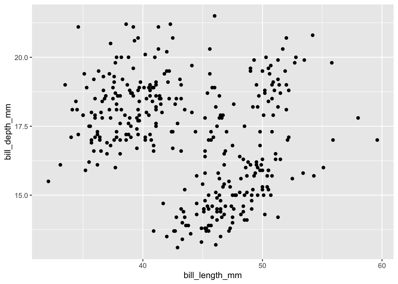
#Add a color to separate the categorical variable
penguins %>%
  ggplot(data = ., aes(
    x = bill_length_mm, y = bill_depth_mm, color = island
  )) +
  geom_point()
## Warning: Removed 2 rows containing missing values (geom_point).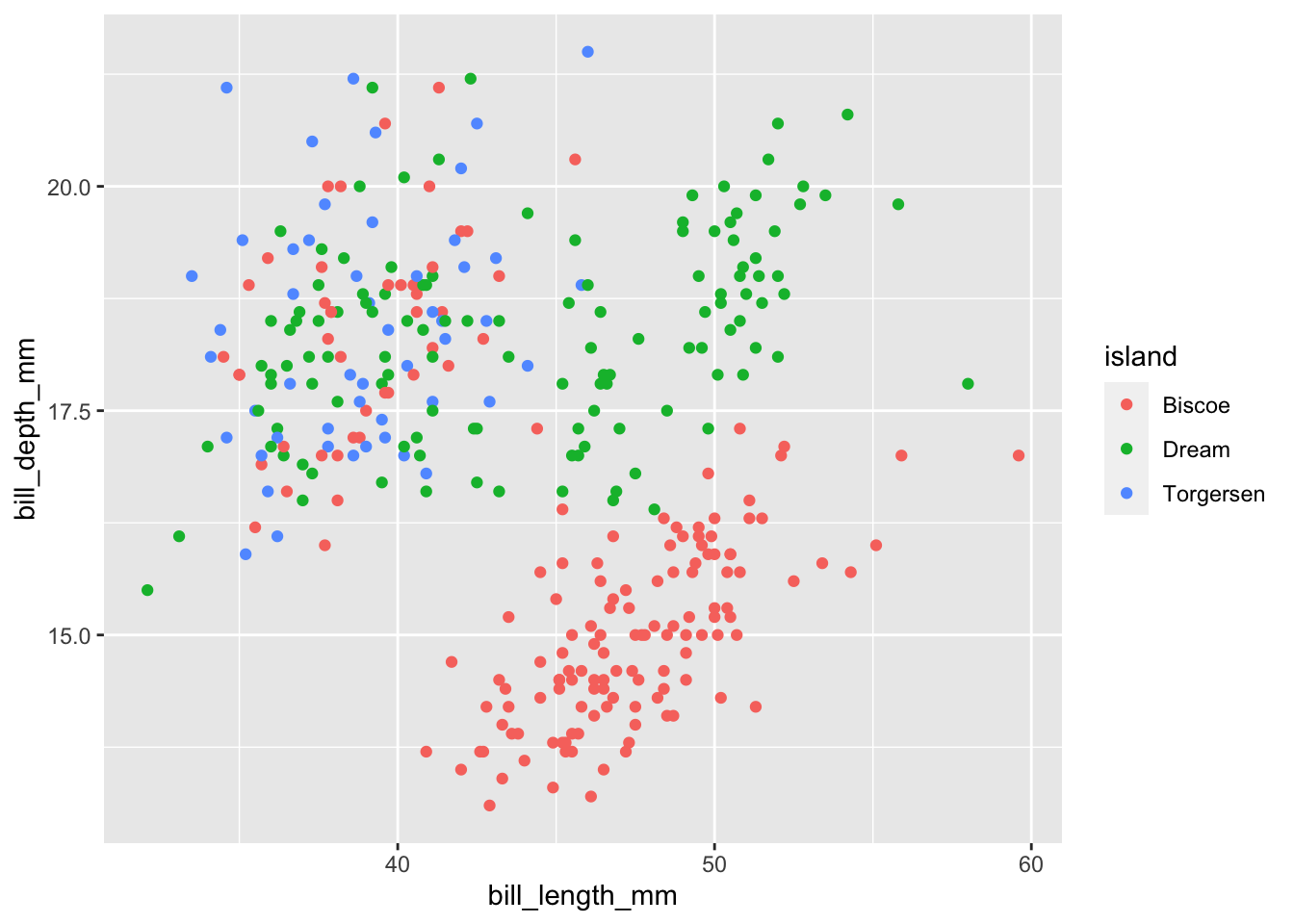
#Add axis labels and a title to your plot
penguins %>%
  ggplot(data = ., aes(
    x = bill_length_mm, y = bill_depth_mm, color = island
  )) +
  geom_point() +
  labs(
    title = "Bill metric correlation",
    x = "Bill Length (mm)",
    y = "Bill depth (mm)"
  )
## Warning: Removed 2 rows containing missing values (geom_point).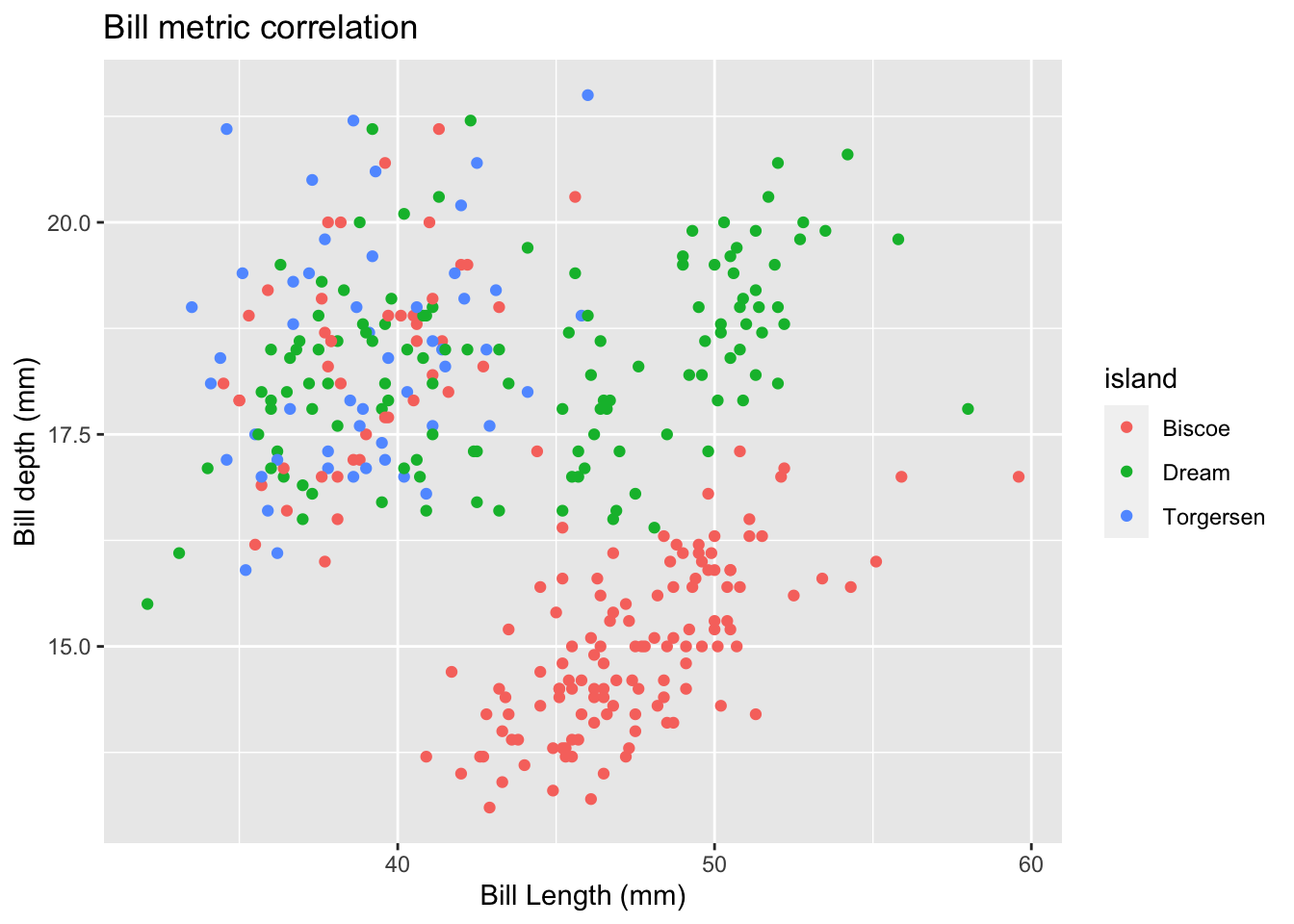
#Make a density plot using geom_density()
penguins %>%
  ggplot(data = ., aes(
    x = bill_length_mm,
  )) +
  geom_density()
## Warning: Removed 2 rows containing non-finite values (stat_density).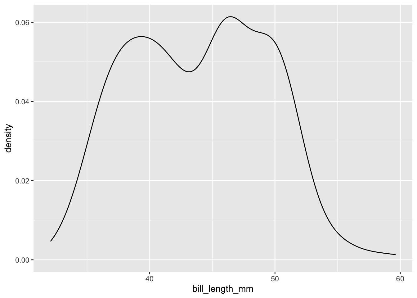
penguins %>%
  ggplot(data = ., aes(
    x = bill_depth_mm
  )) +
  geom_density()
## Warning: Removed 2 rows containing non-finite values (stat_density).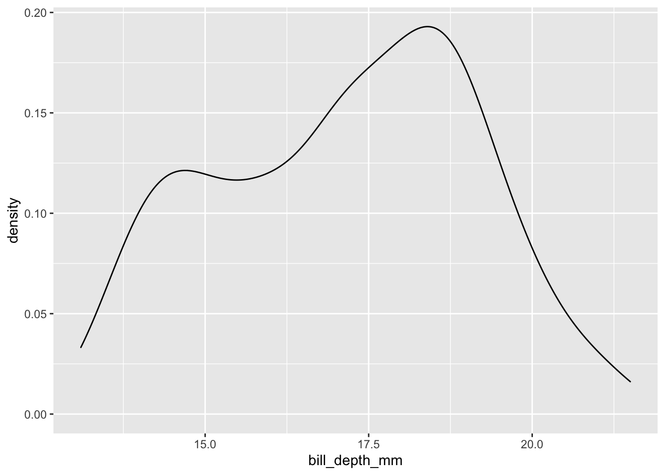
#Add axis labels and a title to your plot
penguins %>%
  ggplot(data = ., aes(
    x = bill_length_mm,
  )) +
  geom_density() +
  labs(main = "My ggplot (don't name it like this)", x = "Bill Lenth (mm)")
## Warning: Removed 2 rows containing non-finite values (stat_density).
#Share with the class which variables you chose and what your plots looked like